Semantic markup
Use SPACEBAR to move forward through slides.
Slide instructions
SPACEBAR to move forward through slides.
SHIFT & SPACEBAR to move backwards through slides.
LEFT ARROW & RIGHT ARROW to move through sections.
ESC to see overview and ESC again to exit.
F to enter presentation mode and ESC to exit.
2.0 Introduction
The aim for today:
- An understanding of the importance of semantic and valid markup.
- An understanding of the correct use of landmarks, headings, links and buttons.
2.1
What is semantic markup?
Semantic markup is about using the appropriate HTML elements to convey meaning.
All HTML elements have a specific meaning and purpose. For example:
| Element | Semantic meaning |
|---|---|
<h1> |
Level 1 heading content |
<caption> |
A visible caption or title for a table |
<abbr> |
An abbreviation or acronym of a longer word or phrase |
<blockquote> |
A section that is quoted from another source |
Even the <div> and <span> elements have meaning. Their purpose is to be generic elements.
| Element | Semantic meaning |
|---|---|
<div> |
Generic block-level container to specify a section |
<span> |
Generic inline container |
Designers need to understand the basics of semantic markup, so they can communicate important information correctly to developers.
Designers should specify the following as part of handover:
- Desired heading levels for all headings.
- Desired sections, possible landmarks and even how these sections should be labelled.
Developers need to know how to use semantic markup as it vital for:
- Accessibility.
- Searchability.
- Internationalisation.
- Interoperability.
Semantic markup is especially important for screen readers as many users rely on specific elements in order to navigate around web pages effectively.
Any questions or comments?
2.2
HTML Content Model Categories
Element categorisation - the old days
Before HTML5, elements were defined into simple broad categories such as:
- Block-level elements.
- Inline elements.
- Replaced elements.
Block level elements
Any element that was formatted visually as a block, with white space above and below.
<!-- Some Block-level examples -->
<h1></h1>
<div></div>
<p></p>
<blockquote></blockquote>
Most block level elements can contain other block level elements. So, it is acceptable to nest a <div> inside another <div>, for example.
<!-- Nested Block-level elements -->
<div>
  <div></div>
</div>
The only exception to this rule is terminal block level elements, which do not allow other block level elements inside. These are heading and paragraph elements.
<!-- Terminal block level elements -->
<h1></h1>
<h2></h2>
<h3></h3>
<h4></h4>
<h5></h5>
<h6></h6>
<p></p>
<!-- Not allowed -->
<h1>
<div></div>
</h1>Inline elements
Elements that did not form new blocks of content. The content is distributed in lines.
<!-- Some inline examples -->
<span></span>
<b></b>
<i></i>
Most inline level elements can contain other inline elements. So, it is acceptable to nest a <i> inside another <span>, for example.
<!-- Nested inline elements -->
<span>
  <i></i>
</span>
However, inline elements cannot contain block level elements. This is considered invalid markup (which will be covered soon).
<!-- Not allowed -->
<span>
  <div></div>
</span>
As part of HTML5, one inline element was changed so that it could be wrapped around block level elements.
<!-- A element wrapped around block -->
<a href="#">
  <div></div>
</a>
This was to allow developers to make entire components “clickable” without the need for JavaScript.
<a href="#">
  <div class="card">
    <img src="a.jpg" alt="Card image">
    <h2>Card heading</h2>
    <p>Card content</p>
    <button>Call to action</button>
  </div>
</a>
From an accessibility perspective, this is terrible, as the entire contents is considered part of the link content, and is announced as a link.
New element categories
The problem with these broad categories (block, inline, replaced etc) was that many elements were anomalies that did not really fit onto a single category.
HTML5 introduced a much more comprehensive set of categories, called “HTML Content Model Categories”.
HTML Content Model categories include:
- Metadata content.
- Flow content.
- Phrasing content.
- Sectioning content.
- Heading content.
- Embedded content.
- Interactive content.
Why do many of these shapes overlap?
Many elements fall into multiple categories.
For example, the <a> element falls into three categories:
- Flow.
- Phrasing.
- Interaction.
We'll look at some of these categories now. For those interested, I've created a page with the full details of each category.
Metadata content
- Sets up the presentation or behaviour of the rest of the content.
- Sets up the relationship of the document with other documents.
<!-- Some Metadata content examples -->
<title>
<link>
<meta>
<script>
<style>
Flow content
- Most elements that are used in the body of documents are categorised as flow content.
- The older “block-level” category roughly corresponds to this category.
<!-- Some Flow content examples -->
<a>
<article>
<blockquote>
<figure>
<h1>
<main>
<p>
<table>
Phrasing content
- Text of the document and elements that mark up that text within paragraphs.
- The older “inline” category corresponds to this category.
<!-- Some Phrasing content examples -->
<a>
<abbr>
<b>
<bdi>
<bdo>
<del>
<i>
Sectioning content
- Content that creates a new section.
- Content that defines the scope of headings and footers.
<!-- All sectioning content elements -->
<article>
<aside>
<nav>
<section>
Heading content
- Defines the header of a section.
<!-- All heading content elements -->
<h1>
<h2>
<h3>
<h4>
<h5>
<h6>
Embedded content
- Content that imports another resource into the document.
<!-- All Embedded content elements -->
<audio>
<canvas>
<embed>
<iframe>
<img>
<math>
<object>
<picture>
<svg>
<video>
Interactive content
- Content that is specifically intended for user interaction.
<!-- All interactive content elements -->
<a>
<audio>
<button>
<details>
<embed>
<iframe>
<img>
<input>
<label>
<select>
<textarea>
<video>
Why do these categories matter?
For designers
Learning about HTML elements work allows you to understand how UI components operate, and communcate information more effectively to developers.
For developers
Understanding how to write valid, well formed HTML markup allows you to write more effective, accessible sites and apps.
Any questions or comments?
2.3
What is valid markup?
Validation is a process of checking your documents against a formal Standard.
In the case of HTML, the relevant standard is the HTML 5.2 Specification.
Developers should always try to produce valid, well formed markup for the following reasons:
1. Browser consistency
Non-valid markup relies on browsers to auto-correct your markup, and each browser does this differently.
2. Page speed
If your code is valid, browsers have to do less processing, therefore the page will render faster.
3. Google search
Google advises that invalid HTML could affect their ability to crawl and index web pages.
4. Accessibility
While invalid markup does not always break accessibility, there is a chance that it can cause accessibility issues.
There are two specific validation issues that can negatively affect assistive technologies:
1. Duplicate IDs
This can break the accessibility of labels for forms and table header cells.
<!-- Duplicate IDs in one document -->
<div id="one"></div>

<label for="one">Name</label>
<input id="one">
2. Lack of alt attributes
This can cause issues for assistive technologies trying to announce text alternatives.
<!-- No ALT attribute -->
<img src="one.jpg">
Any questions or comments?
2.4
Exercise: Validating some sites
Go to either the NRMA website or the AMI website and check the markup via the HTML validator.
2.5
Landmarks
What's the problem?
Complex page layouts can be overwhelming for users. They may need to spend a lot of additional effort scanning the page to find the content they need.
For Designers:
Creating clearly defined visual page regions help two different groups of people.
1. People with cognitive and learning disabilities:
Page regions can help when scanning, searching and prioritising content.
2. People with low vision
Page regions can assist with overall orientation and navigation.
For developers:
Including HTML landmarks as part of your markup can be helpful for two different groups of people.
1. Assistive technology users, such as screen reader users
HTML landmarks can be used to identify and navigate between page regions.
2. Keyboard users
HTML landmarks can be used to navigate around pages more efficiently, without the need for extensive tabbing.
HTML and ARIA landmarks
Before HTML5, there was no way to define page regions using HTML elements. Instead, we used ARIA roles such as role="navigation".
When HTML5 was introduced, a range of new elements was added to define page regions.
This means that there are now two ways to identify landmarks, using HTML elements and ARIA roles.
| Landmark | HTML element | ARIA role |
|---|---|---|
| Header/Banner | <header> |
role="banner" |
| Footer/ContentInfo | <footer> |
role="contentinfo" |
| Nav/Navigation | <nav> |
role="navigation" |
| Main | <main> |
role="main" |
| Aside/Complementary | <aside> |
role="complementary" |
| Section/Region | <section> |
role="region" |
Where possible, you should always use HTML elements for landmarks rather than ARIA roles as these elements have semantics and behaviour already built-in.
The <header> element
The HTML5 <header> element represents a group of introductory or navigational aids.
<header>
</header>
The <header> element can be used multiple times within a single layout.
It could be a header as the overall site header:
<body>
  <header>
  </header>
  <main>
  </main>
  <aside>
  </aside>
  <footer>
  </footer>
</body>
It could be a header as a header for the <main> content:
<main>
  <header>
  </header>
</main>
Or a header for a <section> of content:
<section>
  <header>
  </header>
</section>
Or even as a header for <aside> content:
<aside>
  <header>
  </header>
</aside>
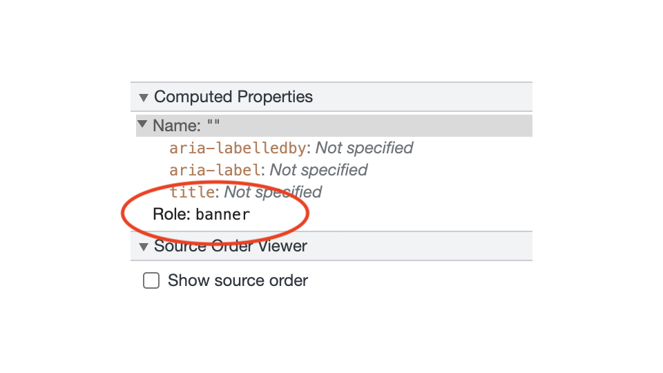
In order for a <header> to be defined as a “banner” landmark:
- It must not be placed inside any other landmark elements.
- It must be the only
<header>outside of any other landmarks.
<body>
  <header>
    Banner landmark
  </header>
  <main>
  </main>
  <aside>
  </aside>
  <footer>
  </footer>
</body>
This means it will be exposed to assistive technologies.

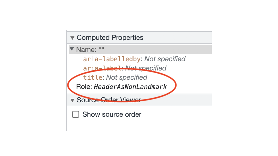
If it does not meet these two conditions, it will not be seen as a “banner” landmark.

The <footer> element
The HTML5 <footer> element represents a footer for its nearest ancestor.
A footer typically contains information about its section such as who wrote it, links to related documents, copyright data, and the like.
<footer>
</footer>
The <footer> element can be used multiple times within a single layout. It is mainly used as the overall site footer:
<body>
  <header>
  </header>
  <main>
  </main>
  <aside>
  </aside>
  <footer>
  </footer>
</body>
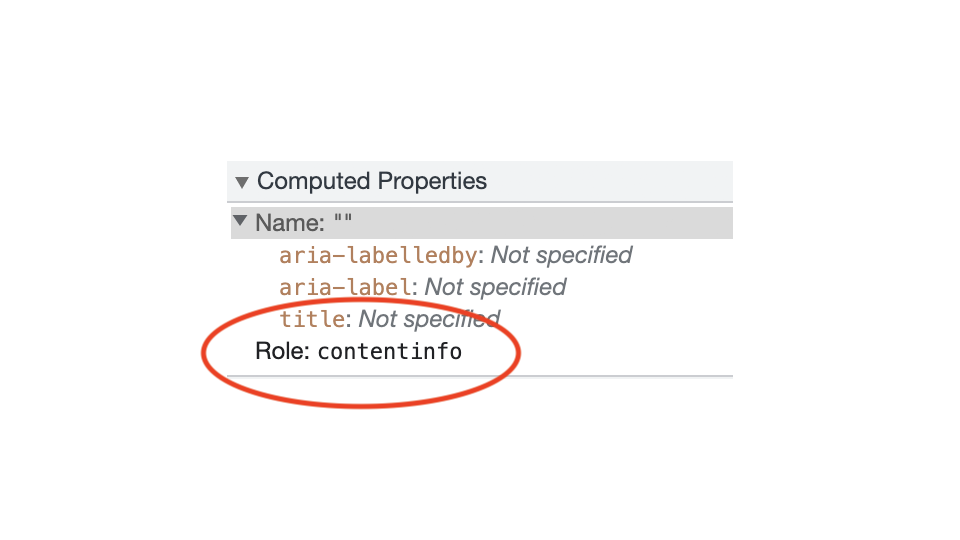
In order for a <footer> to be defined as a “contentinfo” landmark:
- It must not be placed inside any other landmark elements.
- It must be the only
<footer>outside of any other landmarks.
<body>
  <header>
  </header>
  <main>
  </main>
  <aside>
  </aside>
  <footer>
    Contentinfo landmark
  </footer>
</body>
This means it will be exposed to assistive technologies.

The <nav> element
Use the <nav> element to identify the navigation landmark, which contain groups of links used for site or page navigation.
<nav>
  <ul>
    <li><a href="#">Link1</a></li>
    <li><a href="#">Link2</a></li>
    <li><a href="#">Link3</a></li>
  </ul>
</nav>
The <nav> element can be used multiple times within a single layout.
If a page includes more than one navigation landmark, each should have a unique label.
This is achieved using either aria-labelledby if a heading is present, or aria-label if no heading is present.
<nav aria-label="Primary">
  <ul>
    <li><a href="#">Link1</a></li>
    <li><a href="#">Link2</a></li>
    <li><a href="#">Link3</a></li>
  </ul>
</nav>
These two attributes will be covered in a later topic.
The <main> element
Use the <main> elements to identify the main landmark, which is the primary content for the page.
<main>
</main>
Each page must have only one <main> element.
The <main> element should not be contained inside other landmark elements or roles.
The <aside> element
The <aside> element represents a section of a page that could be considered separate from that content.
<aside>
</aside>
The <aside> element should not be contained inside other landmark elements or roles.
If a page includes more than one <aside> element, each should have a unique label.
This is achieved using either aria-labelledby if a heading is present, or aria-label if no heading is present.
These two attributes will be covered in a later topic.
The <section> element
Use the <section> element to identify a region landmark. It should only be used if the page region is sufficiently important that users may want to navigate to it.
<section>
</section>
Each <section> element should be identified, typically by including a heading that is a direct child element.
<section>
  <h3>Section heading</h3>
</section>
These headings could be programmatically associated with their parent elements using the aria-describedby attribute.
<section aria-labelledby="sec01">
  <h3 id="sec01">Section heading</h3>
</section>
This attribute will be covered in a later topic.
The W3C Validator will present a warning message for any section that does not contain a heading as a direct child element.
Warning: Section lacks heading. Consider using h2-h6 elements to add identifying headings to all sections.
Any questions or comments?
2.6
Exercise: Identifying landmarks
Go to either the NRMA website or the AMI website and look for places where landmarks could be used.
Look for the following
- Banner /
<header>. - Footer /
<footer>. - Navigation /
<nav>. - Main /
<main>. - Complementary /
<aside>. - Section /
<section>.
2.7
Headings
Why headings are important
Headings communicate how the content on web pages is structured for sighted users as well as assistive technology users.
Web browsers, plug-ins, and assistive technologies can use them to provide in-page navigation.
Heading ranking
Headings should be nested by their rank. The most important heading has the rank 1 (<h1>), the least important heading rank 6 (<h6>).
Headings with an equal or higher rank should start a new section.
<h1>Page title</h1>
  <h2>Section 1</h2>
    <h3>Subsection 1</h3>
    <h3>Subsection 2</h3>
  <h2>Section 2</h2>
    <h3>Subsection 1</h3>
    <h3>Subsection 2</h3>
Headings with a lower rank should start new subsections that are part of the higher ranked section.
<h1>Page title</h1>
  <h2>Section 1</h2>
    <h3>Subsection 1</h3>
    <h3>Subsection 2</h3>
  <h2>Section 2</h2>
    <h3>Subsection 1</h3>
    <h3>Subsection 2</h3>
Skipping heading ranks can be confusing and should be avoided where possible. For example, make sure that a <h2> is not followed directly by an <h4>.
<h1>Page title</h1>
  <h2>Section 1</h2>
    <h4>Subsection 1</h4>
It is acceptable to skip ranks when closing subsections. For example, a <h2> beginning a new section, can follow an <h3> as it closes the previous section.
<h1>Page title</h1>
  <h2>Section 1</h2>
    <h3>Subsection 1</h3>
    <h3>Subsection 2</h3>
  <h2>Section 2</h2>
    <h3>Subsection 1</h3>
    <h3>Subsection 2</h3>
Exception for fixed page sections
In fixed sections of the page, for example in sidebars, the heading ranks should not change depending on the ranks in the content area.
In those cases, consistency across pages is more important.
<h1>Page title</h1>
  <h2>Section 1</h2>
    <h3>Subsection 1</h3>
    <h3>Subsection 2</h3>
  <h2>Section 2</h2>
    <h3>Subsection 1</h3>
    <h3>Subsection 2</h3>

<!-- Sidebar content across multiple pages -->
<h4>Sidebar heading</h4>
Any questions or comments?
2.8
Exercise: Identifying headings
Go to either the NRMA website or the AMI website and look for places where <h1> to <h6> could be used.
2.9
Links and buttons
Semantic meaning
The purpose of links is to send users to a new location, ie a new page or a different location on the same page.
<a href="#">Find out more</a>The purpose of buttons is to trigger some sort of action - like submitting a form or opening and closing toggles.
<button>Submit</button>Avoiding confusion
From a visual perspective:
- Links can be visually styled to look like buttons.
- Buttons can be visually styled to look like links.
From a markup/semantic perspective, where possible
- Buttons should not be used to operate like links.
- Links should not be used to operate like buttons.
Links and assistive technologies
- Screen readers announce links as: “Link [Link text]”.
- In the case of VoiceOver's Rotator, all links will be listed in the “Links” window.
Buttons and assistive technologies
- Screen readers announce buttons as: “Button [Button text]”.
- In the case of VoiceOver's Rotator, all buttons will be listed in the “Form controls” window.
- When a button comes into focus, most screen readers will switch into forms mode.
All of these things set expectations in the minds of assistive technology users. If the behaviour does not match their expectations, this can lead to confusion.
So, buttons and links should always be used for their correct semantic purpose.
Any questions or comments?
2.10
Exercise: Identifying links and buttons
Go to either the NRMA website or the AMI website and look for places where links vs buttons could be used.