Accessible forms
Use SPACEBAR to move forward through slides.
Slide instructions
SPACEBAR to move forward through slides.
SHIFT & SPACEBAR to move backwards through slides.
LEFT ARROW & RIGHT ARROW to move through sections.
ESC to see overview and ESC again to exit.
F to enter presentation mode and ESC to exit.
3.0 Introduction
The aim for today:
- An understanding of accessible forms, especially the
<label>,<fieldset>and<legend>elements. - An understanding of accessible required fields.
- An understanding of accessible form errors.
3.1
Exercise: An HTML element quiz
We're going to do a quick quiz consisting of two questions. Just type your answers into the chat window.
And remember, there is no judgement here. It’s just a quick warm-up exercise!
Question 1:
List as many of the HTML <input> types as you can.
<!-- Here are 2 examples of all 22 types -->
<input type="text">
<input type="radio">
Ready for the full list?
01 <input type="button">
02 <input type="checkbox">
03 <input type="file">
04 <input type="hidden">
05 <input type="image">
06 <input type="password">
07 <input type="radio">
08 <input type="reset">
09 <input type="submit">
10 <input type="text">
11 <input type="color"> (HTML5)
12 <input type="date"> (HTML5)
13 <input type="datetime-local"> (HTML5)
14 <input type="email"> (HTML5)
15 <input type="month"> (HTML5)
16 <input type="number"> (HTML5)
17 <input type="range"> (HTML5)
18 <input type="search"> (HTML5)
19 <input type="tel"> (HTML5)
20 <input type="time"> (HTML5)
21 <input type="url"> (HTML5)
22 <input type="week"> (HTML5)
<input type="datetime"> (Deprecated)Question 2:
List as many form-related HTML elements as you can.
<!-- Here are 2 examples of all 14 form elements -->
<input>
<label>
Ready for the full list?
01 <button>
02 <fieldset>
03 <form>
04 <input>
05 <label>
06 <legend>
07 <optgroup>
08 <option>
09 <select>
10 <textarea>
11 <datalist> (HTML5)
12 <meter> (HTML5)
13 <output> (HTML5)
14 <progress> (HTML5)
<keygen> (Deprecated)3.2
Which form elements need a label?
The <label> element is used to provide a name for some specific HTML elements.
There are only five HTML elements that should have an associated <label> element:
<!-- INPUT -->
<label for="aaa">Label text</label>
<input id="aaa" type="text">
<!-- SELECT -->
<label for="bbb">Label text</label>
<select id="bbb"></select><!-- TEXTAREA -->
<label for="ccc">Label text</label>
<textarea id="ccc"></textarea><!-- METER -->
<label for="ddd">Label text</label>
<meter id="ddd"></meter><!-- PROGRESS -->
<label for="eee">Label text</label>
<progress id="eee"></progress>Any questions or comments?
3.3
Which form elements don’t need a label?
There are many form-based elements that do not require a <label>.
In many of these cases, adding a <label> would either be invalid, or confusing for assistive technologies.
For the <input> elements with a type of button, reset and submit, the name is provided by the value attribute.
<input type="button" value="Login">
<input type="reset" value="Reset form">
<input type="submit" value="Submit">
For the <input> element with a type of image, the name is provided by the alt attribute.
<input type="image" src="ball.png" alt="Ball">For the <input> element with a type of hidden, no label required as this form control is never presented to the user.
<input type="hidden">The <button> does not require a <label> as its content acts as a <label>.
<button>Content</button>The <fieldset> does not require a <label> as the <legend> acts as a <label>.
<fieldset>
  <legend>Content</legend>
</fieldset>
The <legend> does not require a <label>.
<fieldset>
  <legend>Content</legend>
</fieldset>
The <optgroup> does not require a <label> as the label attribute provides a name.
<label for="aaa">Choose a dinosaur:</label>
<select id="aaa">
  <optgroup label="Theropods">
    <option>Tyrannosaurus</option>
    <option>Velociraptor</option>
  </optgroup>
</select>
The <option> does not require a <label> as its content acts as a <label>.
<label for="aaa">Choose a dinosaur:</label>
<select id="aaa">
  <optgroup label="Theropods">
    <option>Tyrannosaurus</option>
    <option>Velociraptor</option>
  </optgroup>
</select>
The <datalist> does not require a <label> as it is always associated with an <input>.
<label for="aaa">Choose a flavor:</label>
<input id="aaa" list="bbb">
<datalist id="bbb">
  <option value="Chocolate">
  <option value="Mint">
</datalist>
The <form> does not require a <label>.
<form></form>Any questions or comments?
3.4
Which elements should never have a label?
1. The <label> element should never be applied to other non-form related HTML elements.
In the following example, the <label> would not provide an accessible name for the <div> element, so it would not help assistive technologies.
<!-- Do not do this -->
<label>Choose a state</label>
<div>New South Wales</div>
2. The <label> element should never be placed inside other elements, such as the <legend> element.
In the following example, the <label> inside the <legend> would be considered invalid and could be extremely confusing for assistive technologies.
<!-- Do not do this -->
<fieldset>
  <legend>
    <label>Label content</label>
  </legend>
</fieldset>
3. The <label> element should never be used as a replacement for a <legend>.
In the following example, the <label> is not associated with any forn control and would not be announced.
<!-- Do not do this -->
<label>Overall question</label>
<ul>
  <li>
    <input type="radio" id="one" name="yesno">
    <label for="one">Yes</label>
  </li>
  <li>
    <input type="radio" id="two" name="yesno">
    <label for="two">No</label>
  </li>
</ul>
The <label> element should never be used as a replacement for heading element.
<!-- Do not do this -->
<label>Heading content</label>
<p>Paragraph content</p>
<p>Paragraph content</p>
Any questions or comments?
3.5
Explicitly associate labels
For form controls that require a <label>, the <label> need to be explicitly associated with the form control.
Step 1:
Wrap the <label> element around the content associated with the form control.
<label>Full name</label>
<input type="text">
Step 2:
Apply matching for and id values to the <label> and form control.
<label for="name">Full name</label>
<input type="text" id="name">
The for is always applied to the label. It is literally telling assistive technologies:
“This label is for... [ID value]”
<label for="name">Full name</label>
<input type="text" id="name">
The id is always applied to the form control to identify it.
<label for="name">Full name</label>
<input type="text" id="name">
Explicitly associated <label> elements provide the form control with an “accessible name” - a name that is exposed to assistive technologies.
Any questions or comments?
3.6
Exercise: Making an input accessible
Files:
- Open exercises/exercise02-start.html in a text editor and browser.
- View exercises/exercise02-finished.html to check your results.
Our aims are to:
- Change the
<p>wrapped around “Full name” to a<label>. - Explicitly associate the
<label>with the<input>using matching for and id attributes. - Use a value of “name” for the
forandidattributes.
<!-- Before -->
<p class="label">Full name</p>
<input class="input" type="text">
<!-- Step 1: Convert to label -->
<label class="label">Full name</label>
<input class="input" type="text"><!-- Step 2: Add matching for and id values -->
<label class="label" for="name">Full name</label>
<input class="input" type="text" id="name">This means that for Screen Readers, the label contents will be announced when the <input> receives focus.
OSX / VoiceOver
- Chrome: Full name. Edit text.
- Firefox: Full name. Edit text.
- Safari: Full name. Edit text.
Windows / NVDA
- Chrome: Full name. Edit. Blank.
- Firefox: Full name. Edit. Has autocomplete. Blank.
- Edge: Full name. Edit. Blank.
Windows / JAWS
- Chrome: Full name. Edit. Type in text.
- Firefox: Full name. Edit. Type in text.
- Edge: Full name. Edit. Type in text.
3.7
Label order
For <input> elements with a type of radio or checkbox, the <label> element must be positioned after the form control.
<input type="radio" id="yes">
<label for="yes">Yes</label>
<input type="checkbox" id="subscribe">
<label for="subscribe">Subscribe</label>For all other form controls, the <label> element must be positioned before the form control.
<label for="name">Full name</label>
<input type="text" id="name">
<label for="comment">Comment</label>
<textarea id="comment"></textarea><label for="fruit">Choose a fruit</label>
<select id="fruit"></select><label for="fuel">Fuel level:</label>
<meter id="fuel" min="0" max="100">50/100</meter><label for="file">File progress:</label>
<progress id="file" max="100" value="70">70%</progress>Wrapped labels
It is perfectly acceptable to wrap the <label> around the content and form control in the cases where a <label> is required.
In these cases, it is the placement of the <label> content rather than the <label> itself that is critical.
For <label> elements with a type of radio or checkbox, the <label> content must be positioned after the form control.
<label for="yes">
  <input type="radio" id="yes">
  Yes
</label>
<label for="subscribe">
<input type="checkbox" id="subscribe">
Subscribe
</label>For all other form controls, the <label> content must be positioned before the form control.
<label for="name">
  Full name
  <input type="text" id="name">
</label>
<label for="comment">
Comment
<textarea id="comment"></textarea>
</label><label for="fruit">
Choose a fruit
<select id="fruit"></select>
</label><label for="fuel">
Fuel level
<meter id="fuel" min="0" max="100">50/100</meter>
</label><label for="file">
File progress
<progress id="file" max="100" value="70">70%</progress>
</label>Any questions or comments?
3.8
Exercise: Fixing the label order
Files:
- Open exercises/exercise03-start.html in a text editor and browser.
- View exercises/exercise03-finished.html to check your results.
Our aims are to:
- Change the
<p>and<span>elements to<label>elements. - Make sure the
<label>order is correct. - Add a for to match each
idvalue. - Use values of “name” and “subscribe” for the
forandidattributes.
<!-- Before -->
<div class="form-group">
  <input class="input" type="text" id="name">
  <p class="label">Full name</p>
</div>
<div class="form-group">
  <span>Subscribe?</span>
  <input type="checkbox" id="subscribe">
</div>
<!-- Step 1: Covert to LABEL elements -->
<div class="form-group">
<input class="input" type="text" id="name">
<label class="label">Full name</label>
</div>
<div class="form-group">
<label>Subscribe?</label>
<input type="checkbox" id="subscribe">
</div><!-- Step 2: Correct order -->
<div class="form-group">
<label class="label">Full name</label>
<input class="input" type="text" id="name">
</div>
<div class="form-group">
<input type="checkbox" id="subscribe">
<label>Subscribe?</label>
</div><!-- Step 3: Add "for" attribute -->
<div class="form-group">
<label class="label" for="name">Full name</label>
<input class="input" type="text" id="name">
</div>
<div class="form-group">
<input type="checkbox" id="subscribe">
<label for="subscribe">Subscribe?</label>
</div>3.9
Fieldsets and legends
The fieldset
The <fieldset> element represents a set of form controls grouped under a common name.
<fieldset>
  <legend>Contact details</legend>
  ...
</fieldset>
The <fieldset> element allows authors to visually and semantically group related form questions.
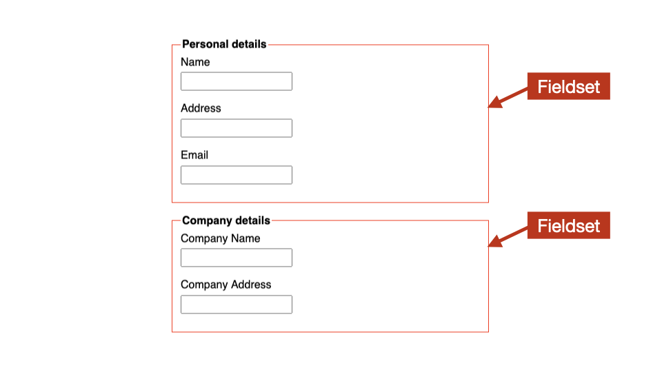
Authors are allowed to nest more than one <fieldset> element inside another <fieldset> element.
<fieldset>
  <legend>Contact details</legend>
  ...
  <fieldset>
    <legend>Additional info</legend>
    ...
  </fieldset>
</fieldset>
The legend
The <legend> element represents a caption for the contents of the <fieldset> element.
<fieldset>
  <legend>Contact details</legend>
  ...
</fieldset>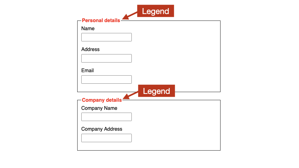
There must be a singe <legend> inside all <fieldset> elements.
<!-- Do not use two LEGENDS -->
<fieldset>
  <legend>First legend</legend>
  ...
  <legend>Second, incorrect legend</legend>
</fieldset>
The <legend> element must be the first child of any <fieldset> element.
<!-- LEGEND must be first child -->
<fieldset>
  <p>Some other content</p>
  <legend>Incorrect legend</legend>
</fieldset>
The <legend> element must not be used outside of <fieldset> element.
<!-- LEGEND should not be used outside FIELDSET -->
<p>Some other content</p>
<legend>Legend used outside of FIELDSET</legend>
<p>Some other content</p>
As of HTML5, <legend> elements are allowed to contain block level elements. This allows authors to add semantic markup, such as headings, to the element.
<fieldset>
  <legend><h3>Contact details</h3></legend>
  ...
</fieldset>
Fieldset and legend uses
The <fieldset> and <legend> allow authors to semantically link an overall question or statement with a series of options.
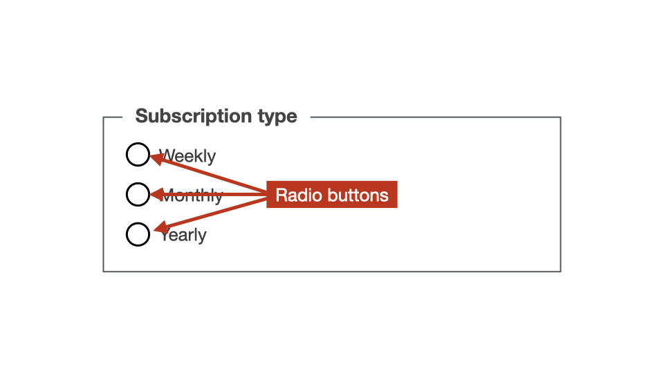
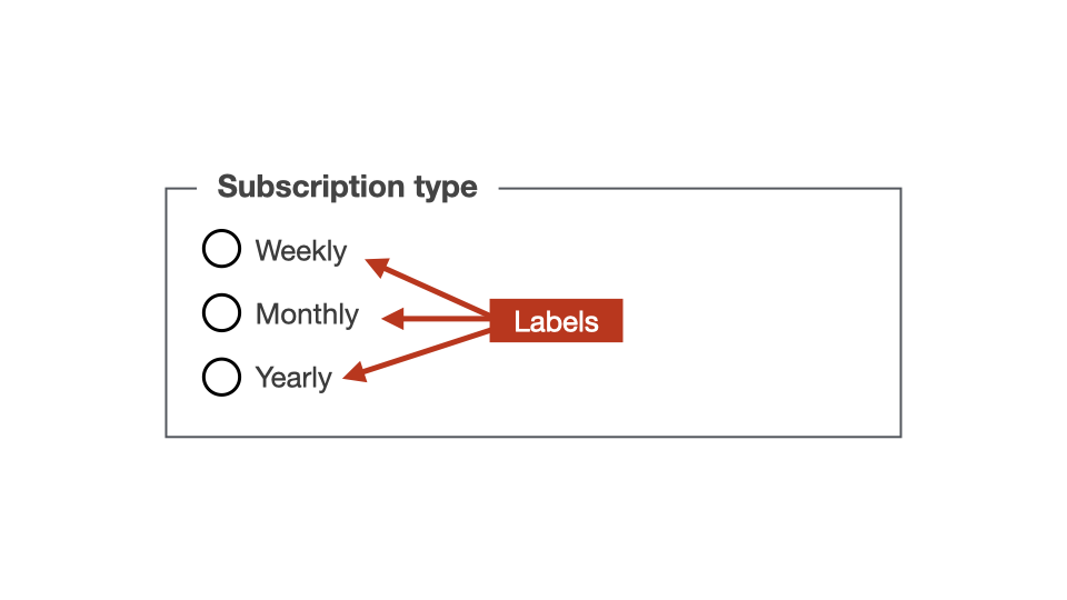
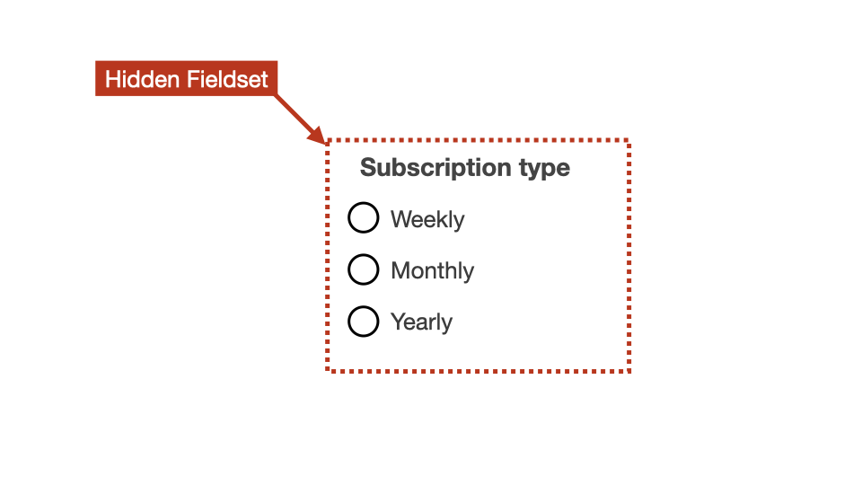
For example, the <fieldset> and <legend> elements must always be used for radio groups.
<fieldset>
  <legend>Subscription type</legend>
  <input id="weekly" type="radio" name="sub">
  <label for="weekly">Weekly</label>

  <input id="monthly" type="radio" name="sub">
  <label for="monthly">Monthly</label>

  <input id="yearly" type="radio" name="sub">
  <label for="yearly">Yearly</label>
</fieldset>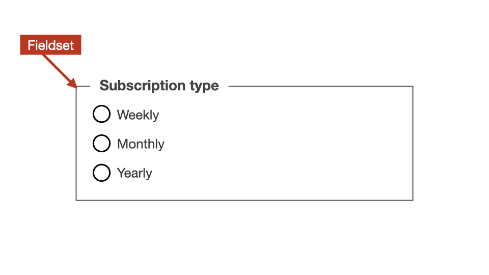
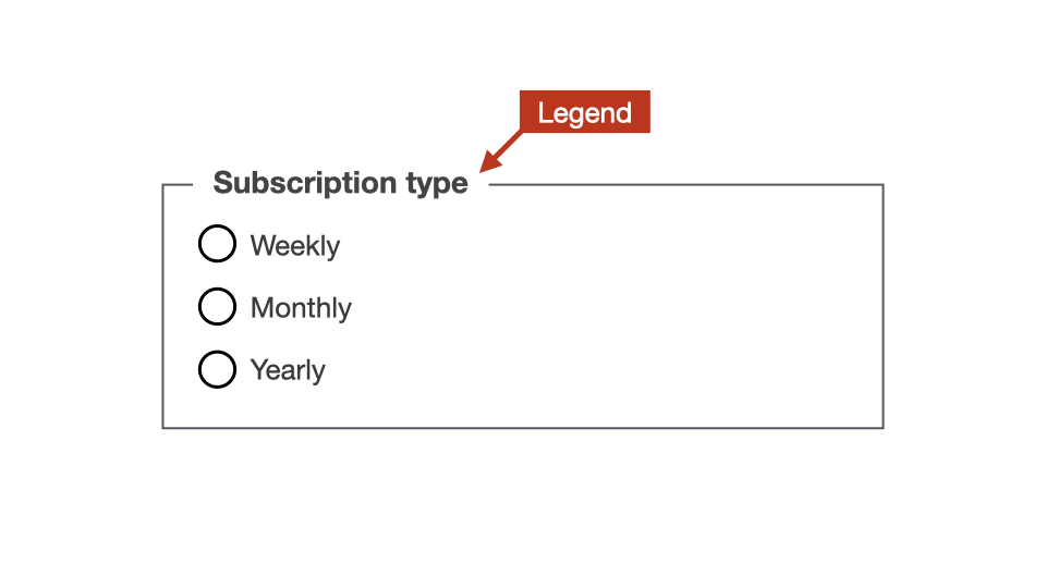
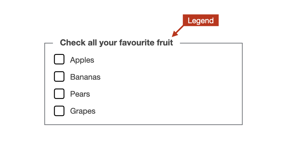
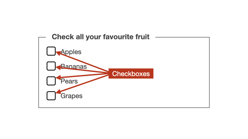
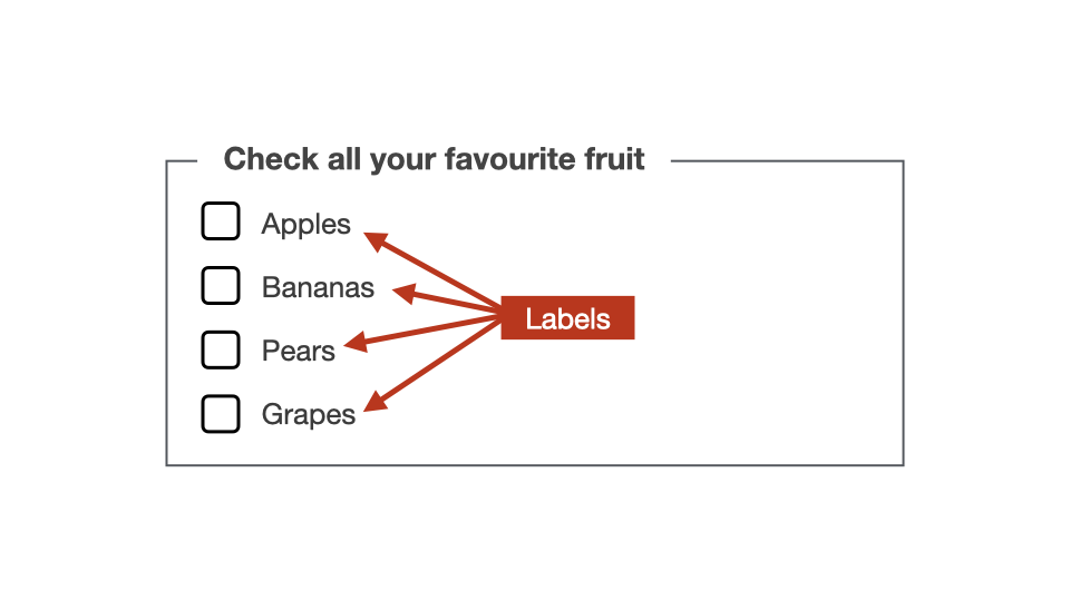
They must always be used for checkbox groups as well.
<fieldset>
  <legend>Check all your favourite fruit</legend>
  <input id="apples" type="radio">
  <label for="apples">Apples</label>

  <input id="bananas" type="radio">
  <label for="bananas">Bananas</label>

  <input id="pears" type="radio">
  <label for="pears">Pears</label>
</fieldset>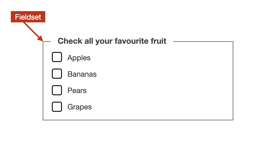
While <fieldset> borders are visible by default, these can easily be removed using CSS.
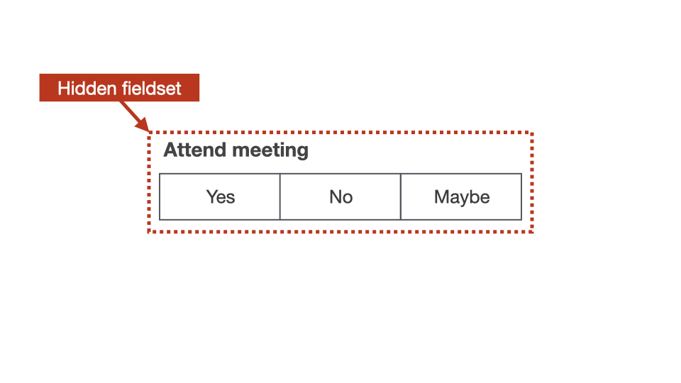
Segmented controls should also be built using <fieldset> and <legend> elements, along with radio buttons for choices.
For segmented controls, the radio buttons are positioned under the <label> element.
This means that they can still be selected/unselected, but the <label> can be styled as needed over the top.
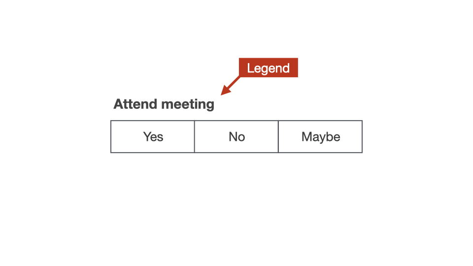
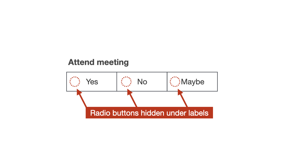
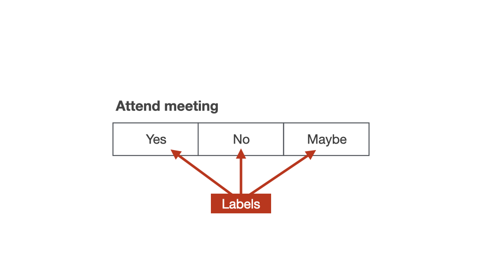
The <fieldset> and <legend> can even be used to create a semantic “Date of Birth” question.
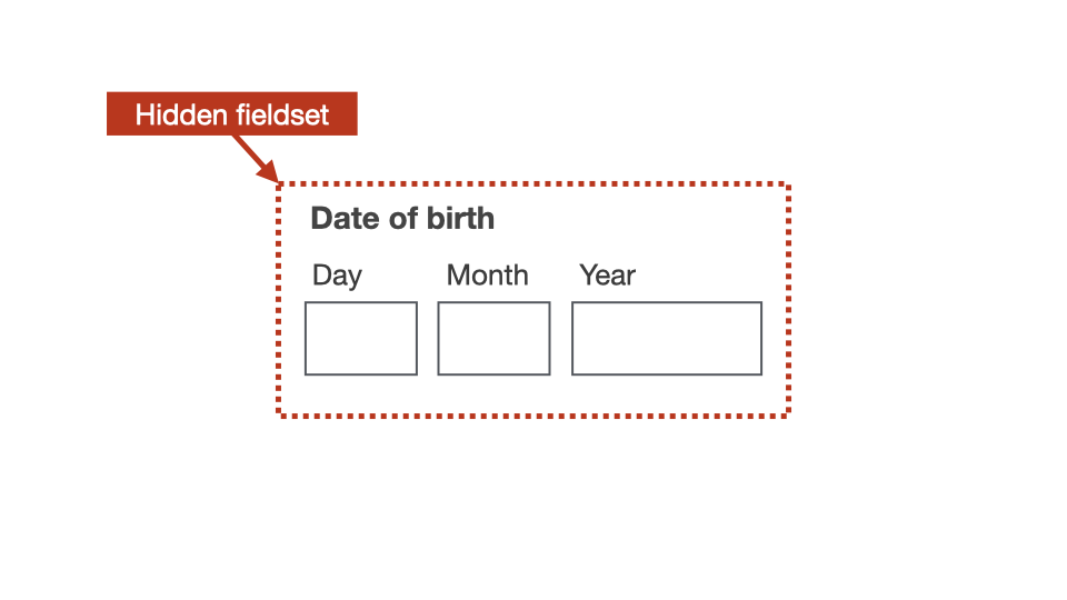
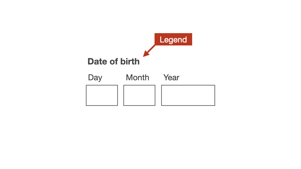
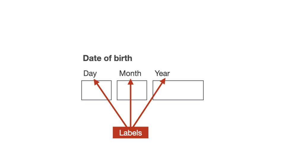
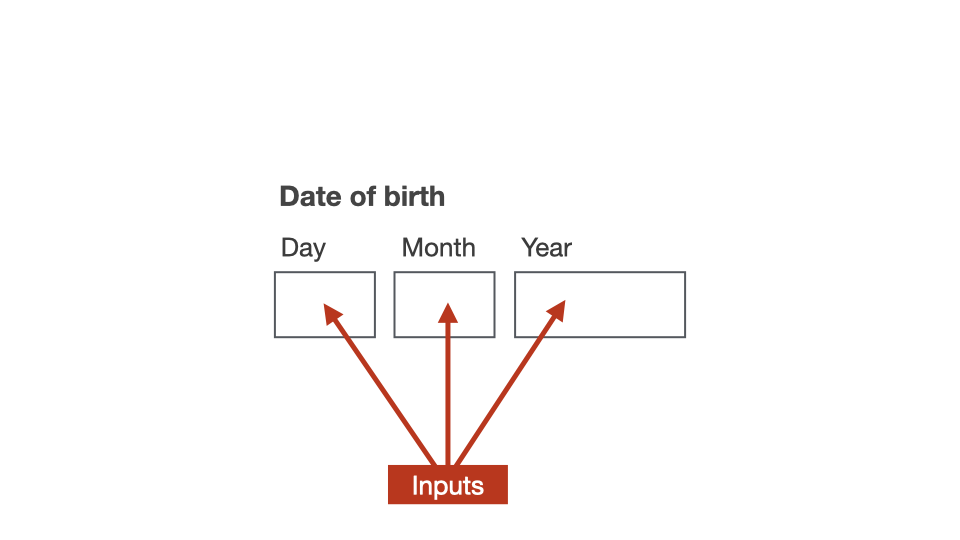
In specific instances where the purpose of a form field is clear to sighted users, the <label> elements can be hidden “off-screen” using CSS.
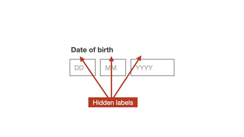
Hiding the <label> off-screen means that it is hidden from sighted users, but still available to screen readers.
Importance for screen readers
When focus moves to the first form control inside a <fieldset>, screen readers will announce the <legend> content along with the label content.
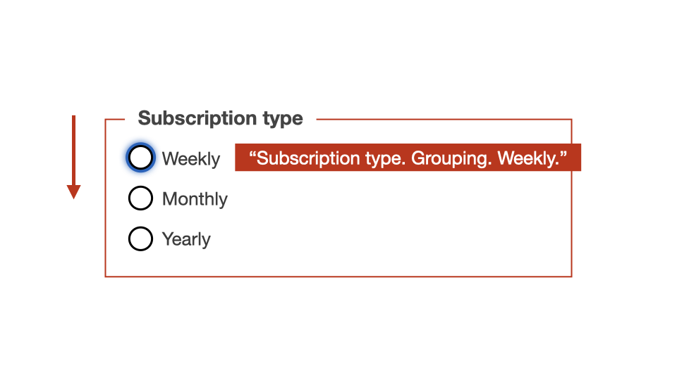
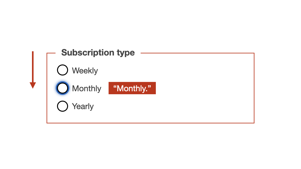
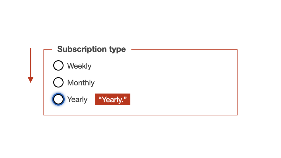
The same happens if the user moves back up the form.
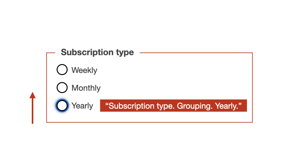
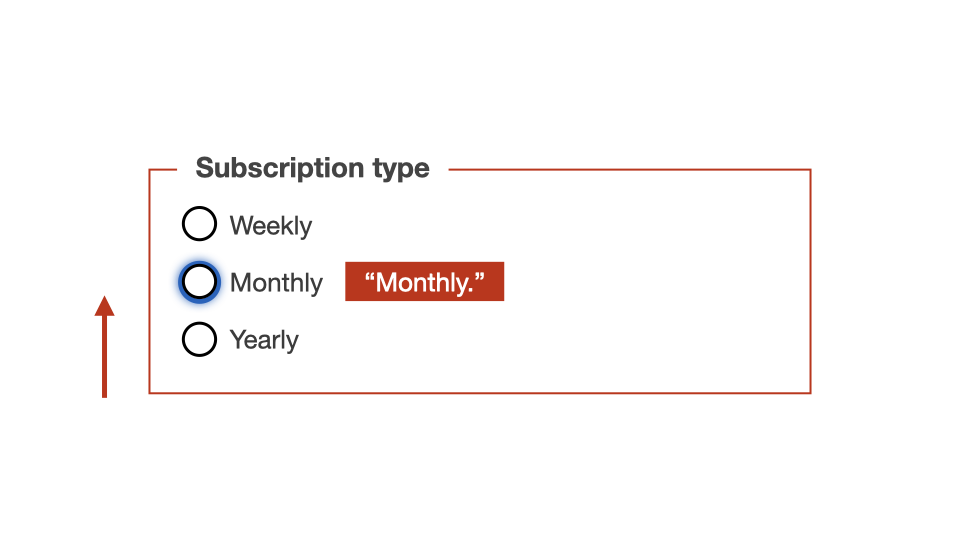
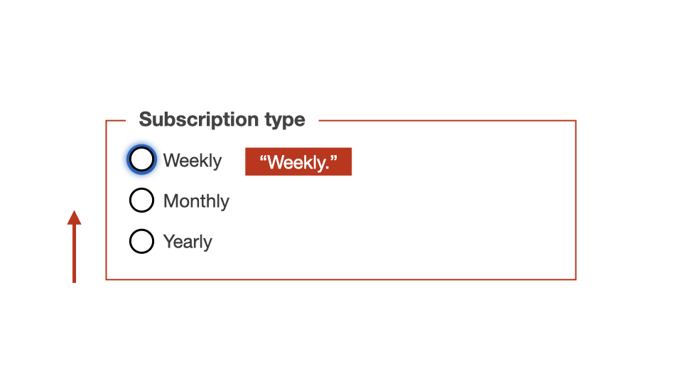
Let’s look at how the <legend> is announced in various screen reader combinations when focus is placed on the <input> element.
<fieldset>
  <legend>Contact details</legend>
  <div>
    <label for="name">Full name</label>
    <input type="text" id="name">
  </div>
</fieldset>
OSX / VoiceOver
- Chrome: Full name. Edit text. Contact details. Group.
- Firefox: Full name. Edit text. Contact details. Group.
- Safari: Full name. Edit text. Contact details. Contact details. Group.
Windows / NVDA
- Chrome: Contact details. Grouping. Full name. Edit. Blank.
- Firefox: Contact details. Grouping. Full name. Edit. Has autocomplete. Blank.
- Edge: Contact details. Grouping. Full name. Edit. Blank.
Windows / JAWS
- Chrome: Contact details. Group. Full name. Edit. Type in text.
- Firefox: Contact details. Full name. Edit. Type in text.
- Edge: Contact details. Group. Full name. Edit. Type in text.
Legends for individual checkboxes or radio buttons?
Do you need a <fieldset> or a <legend> for single radio buttons or checkboxes?
Radio buttons are used for describing a set of related options. So, there should never be a use-case for a single radio button.
However, there are definite user-cases for a single checkbox. An example would be asking users to accept a website’s terms and conditions.
<!-- Example of single checkbox -->
<input type="checkbox" id="agree">
<label for="agree">Agree to conditions</label>
For single checkboxes, the content of the <label> should be written so that there is no need for an overall <legend>.
<!-- No need for FIELDSET or LEGEND -->
<fieldset>
  <legend>Terms and conditions</legend>
  <input type="checkbox" id="agree">
  <label for="agree">Agree to conditions</label>
</fieldset>
Lists for radio groups
Within a radio group, individual radio buttons and their associated <label> elements can be wrapped inside generic block level elements, such as the <div> element.
<fieldset>
  <legend>Do you like boats?</legend>
  <div>
    <input type="radio" id="boats-y" name="boats">
    <label for="boats-y">Yes</label>
  </div>
  <div>
    <input type="radio" id="boats-n" name="boats">
    <label for="boats-n">No</label>
  </div>
</fieldset>
However, these radio buttons could be seen as a list of options, so they could also be placed inside a list.
<fieldset>
  <legend>Do you like boats?</legend>
  <ul>
    <li>
      <input type="radio" id="boats-y" name="boats">
      <label for="boats-y">Yes</label>
    </li>
    <li>
      <input type="radio" id="boats-n" name="boats">
      <label for="boats-n">No</label>
    </li>
  </ul>
</fieldset>
Any questions or comments?
3.10
Exercise: Making a radio group accessible
Files:
- Open exercises/exercise04-start.html in a text editor and browser.
- View exercises/exercise04-finished.html to check your results.
Our aims are to:
- Wrap the radio group and heading in a
<fieldset>. - Convert heading to a
<legend>. - Wrap
<label>around “Yes” and “No”. - Add unique
forandidvalues for both radio options.
<!-- Before -->
<h3>Do you like boats?</h3>
<div>
  <input type="radio" name="boats">
  <span>Yes</span>
</div>
<div>
  <input type="radio" name="boats">
  <span>No</span>
</div>
<!-- Step 1: Wrap heading and list in FIELDSET -->
<fieldset>
<h3>Do you like boats?</h3>
<div>
<input type="radio" name="boats">
<span>Yes</span>
</div>
<div>
<input type="radio" name="boats">
<span>No</span>
</div>
</fieldset><!-- Step 2: Convert heading to LEGEND -->
<fieldset>
<legend>Do you like boats?</legend>
<div>
<input type="radio" name="boats">
<span>Yes</span>
</div>
<div>
<input type="radio" name="boats">
<span>No</span>
</div>
</fieldset><!-- Step 2: Or, wrap heading inside LEGEND -->
<fieldset>
<legend>
<h3>Do you like boats?</h3>
</legend>
<div>
<input type="radio" name="boats">
<span>Yes</span>
</div>
<div>
<input type="radio" name="boats">
<span>No</span>
</div>
</fieldset><!-- Step 3: Convert to LABEL -->
<fieldset>
<legend>Do you like boats?</legend>
<div>
<input type="radio" name="boats">
<label>Yes</label>
</div>
<div>
<input type="radio" name="boats">
<label>No</label>
</div>
</fieldset><!-- Step 4: Add matching FOR and ID values -->
<fieldset>
<legend>Do you like boats?</legend>
<div>
<input type="radio" id="yes" name="boats">
<label for="yes">Yes</label>
</div>
<div>
<input type="radio" id="no" name="boats">
<label for="no">No</label>
</div>
</fieldset>This means that for Screen Readers, the main question will be announced when the form control comes into focus.
OSX / VoiceOver
- Chrome: Yes. Radio button. 2 items. Do you like boats?
- Firefox: Yes. Radio button. 2 item. Do you like boats?
- Safari: Yes. Radio button. Do you like boats? Do you like boats? Group.
Windows / NVDA
- Chrome: Do you like boats? Grouping. Yes. Radio button. Not checked. 1 of 2.
- Firefox: Do you like boats? Grouping. Yes. Radio button. Not checked. 1 of 2.
- Edge: Do you like boats? Grouping. Yes. Radio button. Not checked. 1 of 2.
Windows / JAWS
- Chrome: Do you like boats? Group. Yes. Radio button. Not checked. 1 of 2.
- Firefox: Do you like boats? Yes. Radio button. Not checked. Yes. Radio button. Not checked. 1 of 2.
- Edge: Do you like boats? Group. Yes. Radio button. Not checked. 1 of 2.
3.11
Required fields
Required fields and assistive technologies
All “required” fields within a form must be programmatically identifiable. This is achieved by applying the required attribute.
<label for="name">
  Full name
</label>
<input type="text" id="name" required>
This means that for Screen Readers, the “required” state will be announced.
Visually flagging required fields
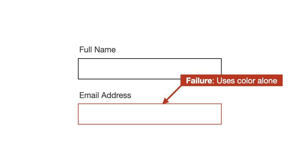
Any required fields must also have some sort of visual indicator, so that sighted users know that these fields must be filled in.
The visually indication method must be:
- Untuitive for users.
- Not use colour-alone
One simple solution is to add the text “(Required)” to the <label> element content. This additional content can also be styled in a colour to make it stand out.
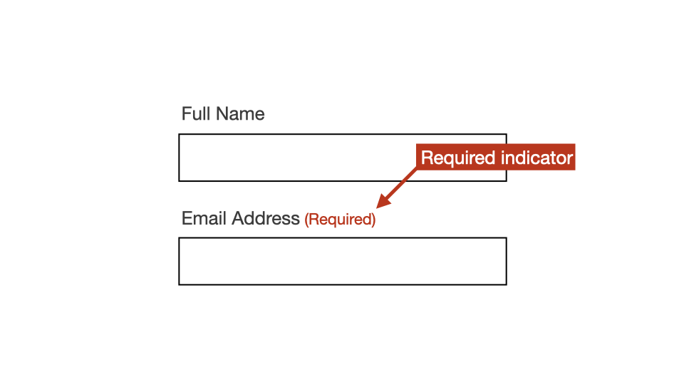
<label for="name">
  Full name
  <span>(Required)</span>
</label>
<input type="text" id="name" required>
This “(Required)” text should be set with aria-hidden="true", to hide this additional information from screen readers.
Screen readers are informed that the field is required via the required attribute, so they don’t need to hear this message from the <label> as well.
<label for="name">
  Full name
  <span aria-hidden="true">(Required)</span>
</label>
<input type="text" id="name" required>
We’ll look at exactly how aria-hidden works in upcoming sessions.
In the old days, some authors used the asterisk symbol to visually define required fields.
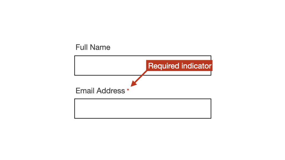
However, this method presents a range of accessibility issues.
1. Users often do not understand the meaning for the asterisk, so a key would need to be presented at the top of the form.
2. The asterisk is also an extremely small indicator, and can be missed by users with poor eye-sight.
3. The asterisk symbol is often ignored or mis-announced by screen readers.
What about when all fields are required?
If all fields in the form are required, users can be presented with a message along the lines of:
“All fields in the form below are required”
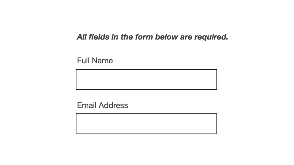
This message must be placed before the form so that Assistive technology users can read this information before entering the form.
Using this method, individual form fields do not have to be visually identified as “required”.
However, if this method is used, all required fields must still include the required attribute.
<label for="name">
  Full name
</label>
<input type="text" id="name" required>
What about when there's a mix of required and optional?
Only required fields need to be flagged to users. So, there are two options:
Option 1:
Visually flag all required fields, even if most of the fields in the form are required.
Option 2:
Visually flag just the optional fields. A message would need to be presented at before the form, along the lines of:
“All fields in the form below are required unless marked OPTIONAL”.
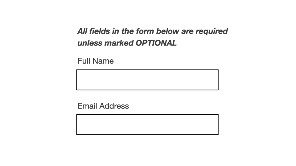
Then all optional fields would need some sort of visual flag:
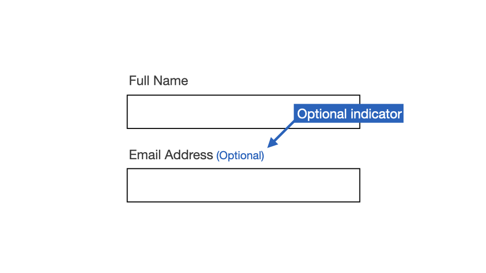
If this method is used, all required fields must still include the required attribute.
<label for="name">
  Full name
</label>
<input type="text" id="name" required>
Any questions or comments?
3.12
Exercise: Adding required features
Files:
- Open exercises/exercise05-start.html in a text editor and browser.
- View exercises/exercise05-finished.html to check your results.
Our aims are to:
- Add
<span class="required"> (Required)</span>for sighted users. - Add
aria-hidden="true"to<span>to hide from screen readers. - Add the
requiredattribute to the<input>for screen reader users.
<!-- Before -->
<label class="label" for="name">
  Full name
</label>
<input id="name" class="input" type="text">
<!-- Step 1: Add required content -->
<label class="label" for="name">
Full name
<span class="required">
(Required)
</span>
</label>
<input id="name" class="input" type="text"><!-- Step 2: Add "aria-required" -->
<label class="label" for="name">
Full name
<span class="required" aria-hidden="true">
(Required)
</span>
</label>
<input id="name" class="input" type="text"><!-- Step 3: Add "required" attributes -->
<label class="label" for="name">
Full name
<span class="required" aria-hidden="true">
(Required)
</span>
</label>
<input class="input" type="text" required>This means that for Screen Readers, will announce the “required” information when the form control comes into focus.
OSX / VoiceOver
- Chrome: Full name. Required. Invalid data. Edit text.
- Firefox: Full name. Required. Invalid data. Edit text.
- Safari: Full name. Required. Edit text.
Windows / NVDA
- Chrome: Full name. Edit. Required. Invalid entry. Blank.
- Firefox: Full name. Edit. Required. Invalid entry. Has autocomplete. Blank.
- Edge: Full name. Edit. Required. Invalid entry. Blank.
Windows / JAWS
- Chrome: Full name. Edit. Required. Invalid entry. Type in text.
- Firefox: Full name. Edit. Required. Invalid entry. Type in text.
- Edge: Full name. Edit. Required. Invalid entry. Type in text.
3.13
Form Errors
Individual form fields with errors
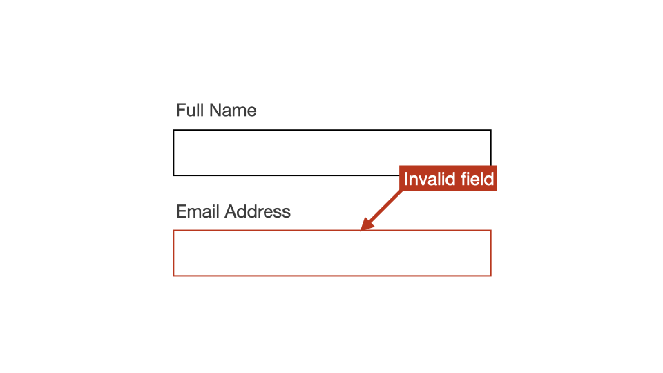
1. Each form field that has errors should be visually “flagged” to show that they are invalid.
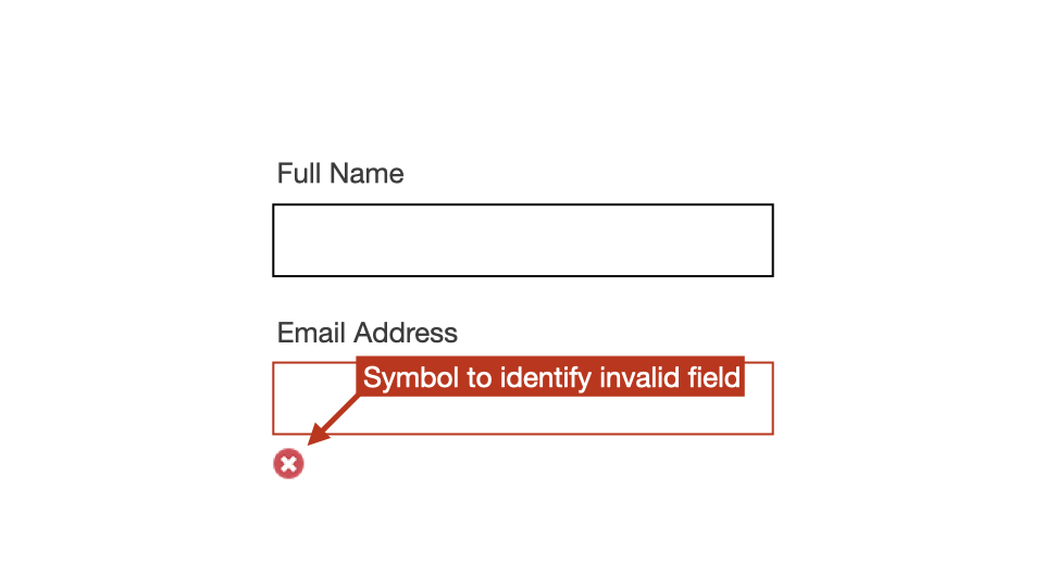
2. The “flagging” method should not use colour alone to signify the invalid state.
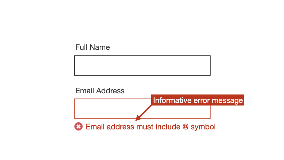
3. An error message should be provided in the direct vicinity of the invalid form field.
4. The error message should be informative - it should provide information that will help users fill in the field correctly.
5. The error message must be programmatically associated with the invalid form field.
This can be achieved using matching aria-describedby and ID values.
<label for="name">Name</label>
<input
  type="text"
  id="name"
  aria-describedby="error-message"
>
<span id="error-message">Error message</span>
6. The invalid form field should be set with aria-invalid="true" to inform assistive technologies that the value entered into the input field does not conform to the format expected by the application.
<label for="name">Name</label>
<input
  type="text"
  id="name"
  aria-describedby="error-message"
  aria-invalid="true"
>
<span id="error-message">Error message</span>
We’ll look at the aria-describedby and aria-invalid attributes in more detail in upcoming sessions.
Multiple errors and on-submit client side form validation
If there are more than one error within the form, a range of actions need to occur as soon as the user attempts to submit the form.
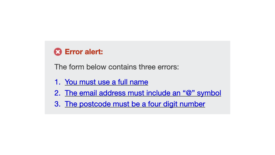
1. An error message must be presented to users, and it should be placed above the form.
2. Focus must shift to the error message.
3. The error message should list all errors.
4. Ideally, each listed error should be a link that takes the user to the relevant form error.
5. The error message must be set with role="alert" as this will announce the error to screen reader users as soon as the error is triggered.
<div role="alert">
  <h3>Error alert</h3>
  <p>The form below contains three errors:</p>
  <ul>
    <li><a href="#a">Form field error 1</a></li>
    <li><a href="#b">Form field error 2</a></li>
    <li><a href="#c">Form field error 3</a></li>
  </ul>
</div>
We’ll look at role="alert" in more detail in upcoming sessions.
6. The error message must also be set with tabindex="0" so that the element can receive focus as soon as it is triggered.
<div role="alert" tabindex="0">
  <h3>Error alert</h3>
  <p>The form below contains three errors:</p>
  <ul>
    <li><a href="#a">Form field error 1</a></li>
    <li><a href="#b">Form field error 2</a></li>
    <li><a href="#c">Form field error 3</a></li>
  </ul>
</div>
What if there is just one error in the form?
In some cases you may have a form with only one error.
In these cases, it is considered acceptable to send focus straight to the form field that contains the error.
In Chroma, the decision was made to always present an error message at the top of the form, even if only one error. This was to maintain consistency for users across all apps.
Any questions or comments?
3.14
Exercise: Accessible error messages
Files:
- Open exercises/exercise06-start.html in a text editor and browser.
- View exercises/exercise06-finished.html to check your results.
Our aims are to:
- Add
aria-describedbyusing a value oferror-messageto<input>. - Add a matching
idvalue to<span>. - Add
aria-invalid="true"to<input>.
<!-- Before -->
<label class="label" for="name">Name</label>
<input
  class="input"
  type="text"
  id="name"
>
<span class="error-message">
  Error: Make sure to include full name
</span>
<!-- Step 1: Add "aria-describedby" -->
<label class="label" for="name">Name</label>
<input
class="input"
type="text"
id="name"
aria-describedby="error-message"
>
<span class="error-message">
Error: Make sure to include full name
</span><!-- Step 2: Add matching "id" value -->
<label class="label" for="name">Name</label>
<input
class="input"
type="text"
id="name"
aria-describedby="error-message"
>
<span class="error-message" id="error-message">
Error: Make sure to include full name
</span><!-- Step 3: Add "aria-invalid" attribute -->
<label class="label" for="name">Name</label>
<input
class="input"
type="text"
id="name"
aria-describedby="error-message"
aria-invalid="true"
>
<span class="error-message" id="error-message">
Error: Make sure to include full name
</span>This means that for Screen Readers, the error message will be announced when the form control comes into focus.
OSX / VoiceOver
- Chrome: Name. Edit text. Error: Make sure to include full name.
- Firefox: Name. Edit text. Error: Make sure to include full name.
- Safari: Name. Edit text. Error: Make sure to include full name.
Windows / NVDA
- Chrome: Name. Edit. Error: Make sure to include full name. Blank.
- Firefox: Name. Edit. Has autocomplete. Error: Make sure to include full name. Blank.
- Edge: Name. Edit. Error: Make sure to include full name. Blank.
Windows / JAWS
- Chrome: Name. Edit. Error: Make sure to include full name. Type in text.
- Firefox: Name. Edit. Error: Make sure to include full name. Type in text.
- Edge: Name. Edit. Error: Make sure to include full name. Type in text.