Non-native widgets and testing
Use SPACEBAR to move forward through slides.
Slide instructions
SPACEBAR to move forward through slides.
SHIFT & SPACEBAR to move backwards through slides.
LEFT ARROW & RIGHT ARROW to move through sections.
ESC to see overview and ESC again to exit.
F to enter presentation mode and ESC to exit.
6.0 Introduction
The aim for today:
- An understanding of native vs non-native widgets.
- The criteria for making non-native widgets accessible.
- Steps for unit testing and auditing.
- If time: How to build an accessible autocomplete.
6.1
What are non-native widgets?
“Widgets” can be anything from a checkbox to a drop-down, a progress loader or a date picker - any self-contained UI component.
“Non-native” means that the widget has been built using one or more elements in a different way than the intended purpose.
Let’s look at a native vs non-native example and see some of the differences in their accessibility.
6.2
A native example
If we use a simple drop-down menu as an example, a native solution would involve using the <label>, <select> and <option> elements.
<label for="fruit">Favourite fruit</label>
<select id="fruit">
  <option>Choose an option</option>
  <option>Apple</option>
  <option>Apricot</option>
  <option>Avocado</option>
</select>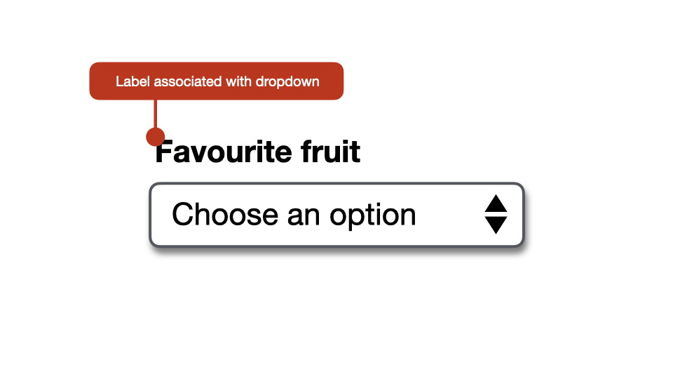
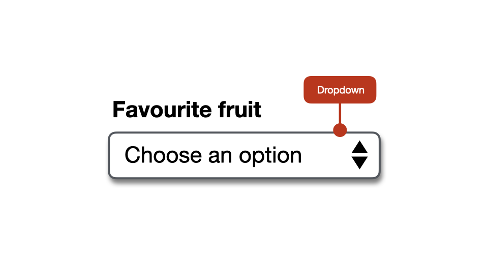
1. Role
The <label>, <select> and <option> elements each have a specific semantic meaning that is understood by accessibility APIs.
The <label> element represents a caption for an item in a user interface.
<label for="fruit">Favourite fruit</label>
<select id="fruit">
  <option>Choose an option</option>
  <option>Apple</option>
  <option>Apricot</option>
</select>
The <select> element represents a control that provides a menu of options - generally as a dropdown list.
In Chrome, the element is defined in the accessibility tree as a “combobox”.
<label for="fruit">Favourite fruit</label>
<select id="fruit">
  <option>Choose an option</option>
  <option>Apple</option>
  <option>Apricot</option>
</select>
The <option> element is used to define menu items or options, contained in a dropdown menu.
<label for="fruit">Favourite fruit</label>
<select id="fruit">
  <option>Choose an option</option>
  <option>Apple</option>
  <option>Apricot</option>
</select>
2. Name
If the <label> and <select> elements are given matching for and id values, the <select> will then have an accessible name.
<label for="fruit">Favourite fruit</label>
<select id="fruit">
  <option>Choose an option</option>
  <option>Apple</option>
  <option>Apricot</option>
</select>
3. Current state
The current state of the <select> element will be defined in the accessibility tree as either “Expanded” or “Collapsed”.
4. Current value
If an <option> is selected it will be defined in the accessibility tree as the value - i.e. “Apple”.
5. Keyboard accessible
There are also a range of pre-defined keystrokes that can be used to interact with the <select> and <option> elements.
Scorecard?
- Role: “Combobox”.
- Name: “Favourite fruit”.
- State: “Collapsed”.
- Current Value: “Apple”.
- Keyboard accessible: Yes.
Any questions or comments?
6.3
A non-native example
An example of a non-native widget would be to use the <button> and <ul> elements to create a dropdown.
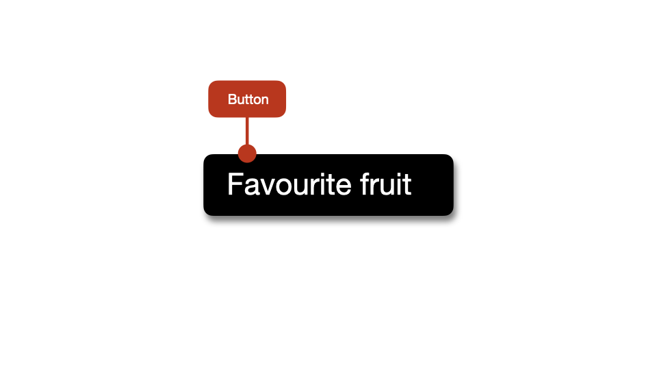
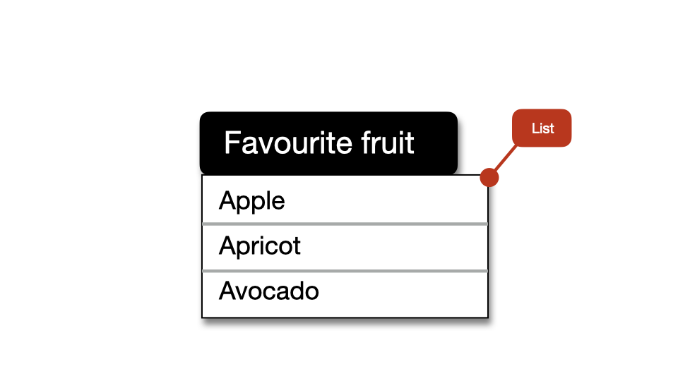
<button>Favourite fruit</button>
<ul>
  <li>Apple</li>
  <li>Apricot</li>
</ul>
1. Role
The <button> element will be defined in the accessibility tree as “button” which is incorrect in this case.
2. Name
This widget will have an accessible name of “Favourite fruit” in the accessibility tree, which is acceptable.
3. Current state
There is no native way to inform users about the dropdown’s current state.
4. Current value
There is no native way to inform users of the currently selected value.
5. Keyboard accessible
The widget will have no native keystrokes defined. So, it is not keyboard accessible.
Scorecard?
- Role: “Button” (Incorrect).
- Name: “Favourite fruit”.
- State: Not available.
- Current Value: Not available.
- Keyboard accessible: No.
All of these problems can fixed using a combination of ARIA and JavaScript. But it takes work.
The simple message here is that we should always try to use native HTML widgets where possible.
Any questions or comments?
6.4
Criteria for accessible widgets
1. Does the widget have all relevant roles defined?
If an element is being used in a different way to its intended purpose, it should be assigned with an explicit ARIA role.
2. Does the widget have an accessible name?
Any element that can receive focus must have an accessible name either directly from the element itself, or via another element.
3. Is the widget keyboard-only accessible?
If the non-native widget does not have native keystrokes in place, these will need to be defined using JavaScript.
4. Are all visible states defined?
If the widget is interactive, it may need to have a range of visible states.
These visible states need to be defined including:
- Static.
- Visited (in the case of links only).
- Hover.
- Focus.
- Active.
- Selected/checked.
- Selected/checked and focussed.
5. Is the functional state of the widget defined?
In cases where non-native widgets have different functional states, these will need to be defined using ARIA including:
aria-checked.aria-selected.aria-expanded.aria-disabled.aria-pressed.
6. Does the widget have dynamically updating content?
In cases where widgets have dynamically added content, the aria-live attribute may be needed.
A non-native widget recap
Does the widget have the following defined:
- All relevant roles?
- An accessible name?
- Keyboard-only accessibility?
- All visible states?
- All functional states?
- Dynamical content?
Any questions or comments?
6.5
In-page tabs
Three roles work together when defining in-page tabs:
tablist.tab.tabpanel.
tablist
The tablist role defines the parent element for a list of tabs.
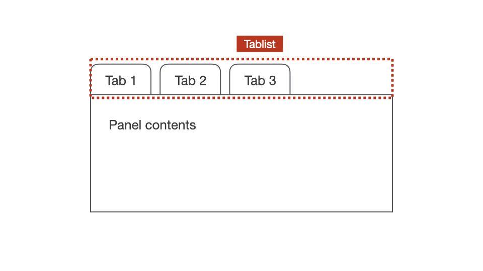
<div role="tablist">
  <button role="tab">One</button>
  <button role="tab">Two</button>
</div>

<div role="tabpanel"></div>
<div role="tabpanel"></div>
tab
The tab role define elements that act as tabs, used to control the visibility of individual tabpanel elements. Each tab must be contained in a tablist.
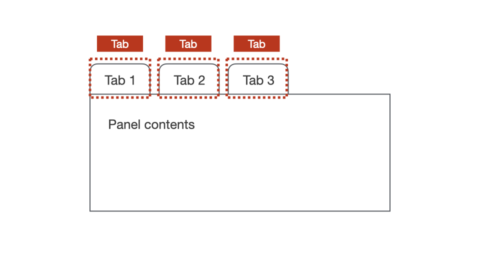
<div role="tablist">
  <button role="tab">One</button>
  <button role="tab">Two</button>
</div>

<div role="tabpanel"></div>
<div role="tabpanel"></div>
tabpanel
The tabpanel is a container for the content associated with a tab. These containers are made visible when tab elements are activated.
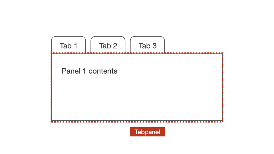
<div role="tablist">
  <button role="tab">One</button>
  <button role="tab">Two</button>
</div>

<div role="tabpanel"></div>
<div role="tabpanel"></div>
aria-controls
The aria-controls attribute identifies the element(s) that are controlled by the current element, when that relationship isn’t represented in the DOM.
This attribute is applied to the controlling element, and is literally saying:
“This element currently controls the [ID] element”.
An example we will see soon is where the tab elements are used to control a series of tabpanel elements.
<div role="tablist">
  <button role="tab" aria-controls="p1">One</button>
  <button role="tab" aria-controls="p2">Two</button>
</div>

<div role="tabpanel" id="p1"></div>
<div role="tabpanel" id="p2"></div>
Any questions or comments?
6.6
Exercise: Making accessible in-page tabs
Files:
- Open exercises/exercise20-start.html in a text editor and browser.
- View exercises/exercise20-finished.html to check your results.
Our aims (part 1):
- The
tablistelement needs to be given an accessible name. - Set
aria-selected="true"on the first<button>. - Set
aria-selected="false"on other<button>elements. - Set
aria-controlson all<button>elements. - Set matching
idvalues on alltabpanelelements.
Our aims (part 2):
- Set all
tabpanelelements withtabindex="0". - Set
hiddenon the second and thirdtabpanelelements. - Set
aria-labelledbyon alltabpanelelements. - Set matching
idvalues on the alltabelements. - Set
tabindex="-1"on the second and thirdtabelements.
Step 1: The tablist element needs to be given an accessible name.
<div role="tablist" aria-label="Animal types">
</div>
Step 2: Set aria-selected="true" on the first <button>.
<button
  role="tab"
  aria-selected="true"
>
  Mammals
</button>
Step 3: Set aria-selected="false" on other <button> elements.
<button
  role="tab"
  aria-selected="false"
>
  Birds
</button>
<button
role="tab"
aria-selected="false"
>
Fish
</button>Note: These states will need to be change dynamically using JavaScript as each <button> is selected.
Step 4: Set aria-controls on all <button> elements.
<button
  role="tab"
  aria-selected="true"
  aria-controls="tabpanel1"
>
  Mammals
</button>
<button
role="tab"
aria-selected="false"
aria-controls="tabpanel2"
>
Birds
</button><button
role="tab"
aria-selected="false"
aria-controls="tabpanel3"
>
Fish
</button>Step 5: Set matching id values on all tabpanel elements.
<div
  role="tabpanel"
  id="tabpanel1"
>
</div>
<div
role="tabpanel"
id="tabpanel2"
>
</div><div
role="tabpanel"
id="tabpanel3"
>
</div>Step 6: Set all tabpanel elements with tabindex="0".
<div
  role="tabpanel"
  id="tabpanel1"
  tabindex="0"
>
</div>
<div
role="tabpanel"
id="tabpanel2"
tabindex="0"
>
</div><div
role="tabpanel"
id="tabpanel3"
tabindex="0"
>
</div>Step 7: Set hidden on the second and third tabpanel elements.
<div
  role="tabpanel"
  id="tabpanel2"
  tabindex="0"
  hidden
>
</div>
<div
role="tabpanel"
id="tabpanel3"
tabindex="0"
hidden
>
</div>Note: These values will need to be change dynamically using JavaScript as each panel becomes visible.
Step 8: Set aria-labelledby on all tabpanel elements.
<div
  role="tabpanel"
  id="tabpanel1"
  tabindex="0"
  aria-labelledby="tab1"
>
</div>
<div
role="tabpanel"
id="tabpanel2"
tabindex="0"
Hidden
aria-labelledby="tab2"
>
</div><div
role="tabpanel"
id="tabpanel3"
tabindex="0"
hidden
aria-labelledby="tab3"
>
</div>Step 9: Set matching id values on the all tab elements.
<button
  role="tab"
  aria-selected="true"
  aria-controls="tabpanel1"
  id="tab1"
>
  Mammals
</button>
<button
role="tab"
aria-selected="false"
aria-controls="tabpanel2"
id="tab2"
>
Birds
</button><button
role="tab"
aria-selected="false"
aria-controls="tabpanel3"
id="tab3"
>
Fish
</button>Step 10: Set tabindex="-1" on the second and third tab elements.
<button
  role="tab"
  aria-selected="false"
  aria-controls="tabpanel2"
  id="tab2"
  tabindex="-1"
>
  Birds
</button>
<button
role="tab"
aria-selected="false"
aria-controls="tabpanel3"
id="tab3"
tabindex="-1"
>
Fish
</button>6.7
A basic accessibility testing process
Two types of accessibility testing
| Unit testing individual widgets | Auditing a screen or series of screens | |
|---|---|---|
| What: | Rigorous testing of individual widgets, especially complex non-native widgets. | WCAG compliance audits on one or more screens within a website or application. |
| When: | Before the widget is used in any application. | At any stage in the process. Generally, the earlier the better. |
The following is a simple auditing process that can be used to conduct a basic audit of any website or web application.
Each step in the process includes:
- What to test.
- How to test.
- Who should test.
- Relevant WCAG criteria.
Step 1: Valid markup
What to test:
Check that all HTML markup is valid HTML5 markup as defined by the W3C.
How to test:
Markup validity can re checked via W3C Validator tool.
Who should test:
- Testers.
- Developers.
Relevant WCAG Success Criteria:
In content implemented using markup languages, elements have complete start and end tags, elements are nested according to their specifications, elements do not contain duplicate attributes, and any IDs are unique, except where the specifications allow these features.
Step 2: Text resize
What to test:
Check that the text can increase to 200% without loss of functionality.
How to test:
Zoom Page WE provides functionality to zoom a web page using full-page zoom or text-only zoom to a range of different percentages.
Who should test:
- UX and UI Designers.
- Testers.
Relevant WCAG Success Criteria:
Except for captions and images of text, text can be resized without assistive technology up to 200 percent without loss of content or functionality.
Step 3: Keyboard access
What to test - part 1:
Check that all functionality within the site or app is operable through a keyboard interface, without the need for a mouse or touchpad.
What to test - part 2:
Check that focus can be moved away from any component using only a keyboard interface (i.e focus does not get trapped within a component).
How to test:
- Navigate through the site or app using TAB and SHIFT + TAB keystrokes.
- Test all actions using ENTER, RETURN, SPACEBAR and ESC keys as needed.
- Make sure focus does not get trapped inside a component.
Who should test:
- UX and UI Designers.
- Testers.
- Developers.
Relevant WCAG Success Criteria - part 1:
All functionality of the content is operable through a keyboard interface without requiring specific timings for individual keystrokes, except where the underlying function requires input that depends on the path of the user's movement and not just the endpoints.
Relevant WCAG Success Criteria - part 2:
2.1.2 No Keyboard Trap (Level A)
If keyboard focus can be moved to a component of the page using a keyboard interface, then focus can be moved away from that component using only a keyboard interface, and, if it requires more than unmodified arrow or tab keys or other standard exit methods, the user is advised of the method for moving focus away.
Step 4: Focus state visibility
What to test:
Check that focus states are clearly visible for all focusable elements.
How to test:
Navigate through the site or app using TAB and SHIFT + TAB keystrokes. Review focus states for all focusable elements.
Who should test:
- UI Designers
- Testers.
Relevant WCAG Success Criteria:
2.4.7 Focus Visible (Level AA)
Any keyboard operable user interface has a mode of operation where the keyboard focus indicator is visible.
Step 5: Focus order
What to test:
Check that focus order is intuitive and consistent across all screens.
How to test:
- Navigate through the site or app using TAB and SHIFT + TAB keystrokes.
- Review focus order for all focusable elements.
- Make sure focus order does not jump to different areas of the layout non-sequentially.
Who should test:
- UX and UI Designers.
- Testers.
- Developers.
Relevant WCAG Success Criteria:
If a Web page can be navigated sequentially and the navigation sequences affect meaning or operation, focusable components receive focus in an order that preserves meaning and operability.
Step 6: WAVE testing
What to test:
Basic accessibility review of each screen:
- WCAG Errors and warnings.
- WCAG Colour contrast issues.
- Use of headings.
- Use of
<label>,<fieldset>,<legend>. - Use of landmarks.
How to test:
Using the WAVE browser plugin.
Who should test:
- UX and UI Designers.
- Testers.
- Developers.
Relevant WCAG Success Criteria:
The WAVE testing tool can be used to pick up a wide range of errors across multiple WCAG Success Criteria.
Step 7: Screen reader testing
What to test:
Basic screen reader review of each screen.
How to test as part of an audit:
Check each screen to make sure all components of the layout are clearly described and meaningful to screen reader users. Using one or both:
- Voiceover: Chrome.
- NVDA: Chrome.
How to test as part of unit testing:
- Is there an accessible name, description, role?
- Are states clearly announced?
- Are all features of the widget announced?
- Is dynamically added content announced?
How to test as part of unit testing: (continued)
This more complex testing may include a wider range of screen reader and browser combinations.
- Windows/JAWS: Chrome, Firefox, Edge.
- Windows/NVDA: Chrome, Firefox, Edge.
- OSX/VoiceOver: Chrome, Firefox, Safari.
Who should test:
- Testers.
- Developers.
Relevant WCAG Success Criteria:
1.3.1 Info and Relationships (Level A)
Information, structure, and relationships conveyed through presentation can be programmatically determined or are available in text.
Step 8: Mobile text size
What to test:
This test should also be conducted using mobile devices to determine how increasing the text size affects the layout.
How to test:
Use the phone's settings to increase text size to at least 200% to determine if any functionality is lost.
Who should test:
- UX and UI Designers.
- Testers.
Relevant WCAG Success Criteria:
Except for captions and images of text, text can be resized without assistive technology up to 200 percent without loss of content or functionality.
Step 9: Mobile screen reader testing
What to test:
Basic screen reader review of each screen. Make sure all components of the layout are clearly described and meaningful to screen reader users.
How to test:
Check each screen with either or both:
- iPhone: Voiceover.
- Android: Talkback.
Who should test:
- Testers.
- Developers.
Relevant WCAG Success Criteria:
1.3.1 Info and Relationships (Level A)
Information, structure, and relationships conveyed through presentation can be programmatically determined or are available in text.
A recap
- Step 1: Valid markup.
- Step 2: Text resize.
- Step 3: Keyboard access.
- Step 4: Focus state visibility.
- Step 5: Focus order.
- Step 6: WAVE testing.
- Step 7: Screen reader testing.
- Step 8: Mobile text size.
- Step 9: Mobile screen reader testing.
Any questions or comments?
6.8
Exercise: Conducting some testing
Go to either the NRMA website or the AMI website.
Our aims are to conduct some quick tests:
- Valid markup.
- Text resize.
- WAVE testing.
1. Validation
Checked the validity of markup via W3C Validator tool.
2. Text resize
Check the text resize via Zoom Page WE tool.
3. WAVE test
Check the page's accessibility using the WAVE browser plugin.
6.9
Exercise: Making an accessible autocomplete
Files:
- Open exercises/exercise21-start.html in a text editor and browser.
- View exercises/exercise21-finished.html to check your results.
Our aims (part 1):
- Add
role="searchbox". - Add
aria-describedby="instructions". - Add
aria-owns="results". - Add
aria-expanded="false". - Add
aria-autocomplete="both". - Add
id="results". - Add
role="listbox".
Our aims (part 2):
- Add
tabindex="-1". - Add
role="option". - Add
aria-selected="false". - Add
class="sr-only". - Add
aria-live="assertive". - Add
class="sr-only".
We’re now going to add accessible markup to an autocomplete widget - keeping in mind the “seven non-native widget criteria”.
Also note that this example is not “operational”, we are just focusing on the markup.
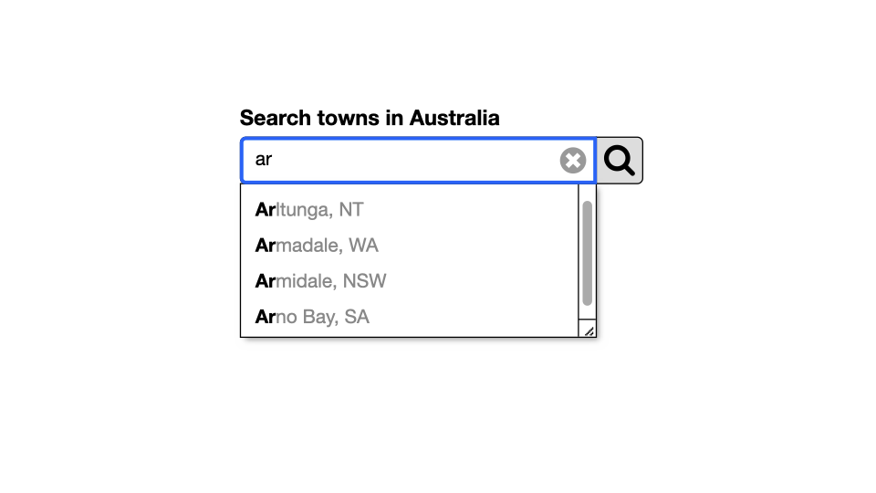
Review of elements used for the widget
First off, let’s look at the basic markup already in place.
The widget is placed inside a <form> component.
<form action="#">
  <label for="search">Search towns in Australia:</label>
  <input type="text" id="search">
  <button type="button">Clear</button>
  <button type="submit">Search</button>
  <ul id="results">
    <li>Aarons Pass</li>
  </ul>
  <div id="instructions"></div>
  <div></div>
</form>
There is a <label> to provide an accessible name for the <input>.
<form action="#">
  <label for="search">Search towns in Australia:</label>
  <input type="text" id="search">
  <button type="button">Clear</button>
  <button type="submit">Search</button>
  <ul id="results">
    <li>Aarons Pass</li>
  </ul>
  <div id="instructions"></div>
  <div></div>
</form>
The <input> is programatically associated with the <label> via matching for and id values.
<form action="#">
  <label for="search">Search towns in Australia:</label>
  <input type="text" id="search">
  <button type="button">Clear</button>
  <button type="submit">Search</button>
  <ul id="results">
    <li>Aarons Pass</li>
  </ul>
  <div id="instructions"></div>
  <div></div>
</form>
The first <button> is used to clear the <input> field.
<form action="#">
  <label for="search">Search towns in Australia:</label>
  <input type="text" id="search">
  <button type="button">Clear</button>
  <button type="submit">Search</button>
  <ul id="results">
    <li>Aarons Pass</li>
  </ul>
  <div id="instructions"></div>
  <div></div>
</form>
The second <button> is used to clear submit.
<form action="#">
  <label for="search">Search towns in Australia:</label>
  <input type="text" id="search">
  <button type="button">Clear</button>
  <button type="submit">Search</button>
  <ul id="results">
    <li>Aarons Pass</li>
  </ul>
  <div id="instructions"></div>
  <div></div>
</form>
The <ul> displays possible results when triggered.
<form action="#">
  <label for="search">Search towns in Australia:</label>
  <input type="text" id="search">
  <button type="button">Clear</button>
  <button type="submit">Search</button>
  <ul id="results">
    <li>Aarons Pass</li>
  </ul>
  <div id="instructions"></div>
  <div></div>
</form>
The first <div> is used to provide instructions in using the widget.
<form action="#">
  <label for="search">Search towns in Australia:</label>
  <input type="text" id="search">
  <button type="button">Clear</button>
  <button type="submit">Search</button>
  <ul id="results">
    <li>Aarons Pass</li>
  </ul>
  <div id="instructions"></div>
  <div></div>
</form>
The second <div> is used to provide live updates associated with how many results are displayed in the dropdown at any given time.
<form action="#">
  <label for="search">Search towns in Australia:</label>
  <input type="text" id="search">
  <button type="button">Clear</button>
  <button type="submit">Search</button>
  <ul id="results">
    <li>Aarons Pass</li>
  </ul>
  <div id="instructions"></div>
  <div></div>
</form>
Adding accessibility
Step 1: Add role="searchbox" to <input>.
This will change the input element's role from textbox to searchbox.
<input
  type="text"
  id="search"
  role="searchbox"
>
Step 2: Add aria-describedby="instructions" to <input>.
This will be used to link up with the instructions content to provide an accessible description for the <input>.
<input
  type="text"
  id="search"
  role="searchbox"
  aria-describedby="instructions"
>
Step 3: Add aria-owns="results" to <input>.
This will be used to provide a relationship between the <input> and <ul> element.
<input
  type="text"
  id="search"
  role="searchbox"
  aria-describedby="instructions"
  aria-owns="results"
>
Step 4: Add aria-expanded="false" to <input>.
This will change to aria-expanded="true" when the <ul> is triggered and becomes visible.
<input
  type="text"
  id="search"
  role="searchbox"
  aria-describedby="instructions"
  aria-owns="results"
  aria-expanded="false"
>
Step 5: Add aria-autocomplete="both" to <input>.
The "both" value means that resulting values may be displayed either as a dropdown list or inline (within the <input>).
<input
  type="text"
  id="search"
  role="searchbox"
  aria-describedby="instructions"
  aria-owns="results"
  aria-expanded="false"
  aria-autocomplete="both"
>
Step 6: Add id="results" to <ul>.
This will relate to the aria-owns value associated with the <input>.
<ul
  id="results"
>
  <li>Aarons Pass</li>
</ul>
Step 7: Add role="listbox" to <ul>.
This will define the element as a parent for a list of options.
<ul
  id="results"
  role="listbox"
>
  <li>Aarons Pass</li>
</ul>
Step 8: Add tabindex="-1" to <ul>.
This element will initially be hidden, and should not receive focus until it becomes visible.
<ul
  id="results"
  role="listbox"
  tabindex="-1"
>
  <li>Aarons Pass</li>
</ul>
Step 9: Add role="option" to each <li>.
This will define the elements as options.
<ul
  id="results"
  role="listbox"
  tabindex="-1"
>
  <li role="option">Aarons Pass</li>
</ul>
Step 10: Add aria-selected="false" to each <li>.
This will need to change to aria-selected="true" when an individual option is selected.
<ul
  id="results"
  role="listbox"
  tabindex="-1"
>
  <li role="option" aria-selected="false">Aarons Pass</li>
</ul>
Step 11: Add class="sr-only" to the first <div> element.
This will hide the element off-screen but still make it available to assistive technologies.
<div id="instructions" class="sr-only">
</div>
Step 12: Add aria-live="assertive" to the second <div> element.
This will allow dynamic changes to be announced to assistive technologies.
<div aria-live="assertive"></div>
Step 13: Add class="sr-only" to the second <div> element.
This will hide the element off-screen but still make it available to assistive technologies.
<div aria-live="assertive" class="sr-only"></div>
The dynamically announced information could be something like:
6 options available. Use up and down arrows to review and ENTER to select.