Intro to ARIA
Use SPACEBAR to move forward through slides.
Slide instructions
SPACEBAR to move forward through slides.
SHIFT & SPACEBAR to move backwards through slides.
LEFT ARROW & RIGHT ARROW to move through sections.
ESC to see overview and ESC again to exit.
F to enter presentation mode and ESC to exit.
4.0 Introduction
The aim for today:
- An introduction to the Accessibility Tree, accessible names and descriptions.
- An understanding of ARIA.
- The difference between
aria-describedby,aria-labelledbyandaria-label.
4.1
Accessibility APIs
Accessibility APIs communicate information about the user interface from the browser to the Assistive Technology.
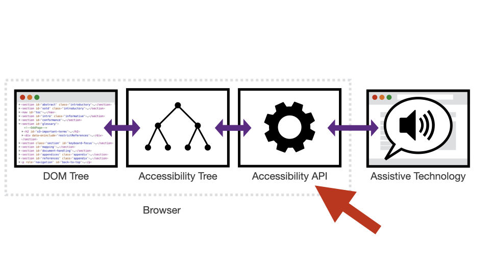
There have been many Accessibility APIs released over the years, all building on and improving previous versions.
| Year | API | Who | For |
|---|---|---|---|
| 1997 | Microsoft Active Accessibility (MSAA) | Microsoft | Windows 95 |
| 1998 | IAccessible | IBM/Sun | Cross platform |
| 2001 | Assistive Technology Service Provider Interface (AT-SPI) | Linux | Linux OS |
| 2002 | NSAccessibility | Apple | Mac OS 10.2 |
| 2007 | User Interface Automation (UIA) | Microsoft | Windows 7 |
| 2007 | IAccessible2 | IBM | Windows and Linux |
| 2009 | UI Accessibility API | Apple | iOS 3 |
Browsers generally support one or more of the available accessibility APIs for the platform they’re running on.
Windows:
- Firefox, Chrome and Opera support MSAA/IAccessible and IAccessible2.
- Internet Explorer supports MSAA/IAccessible and UIAExpress.
OSX:
- Safari, Firefox and Chrome support NSAccessibility.
iOS:
- Safari, Firefox and Chrome support UIAccessibility.
4.2
Accessibility Tree
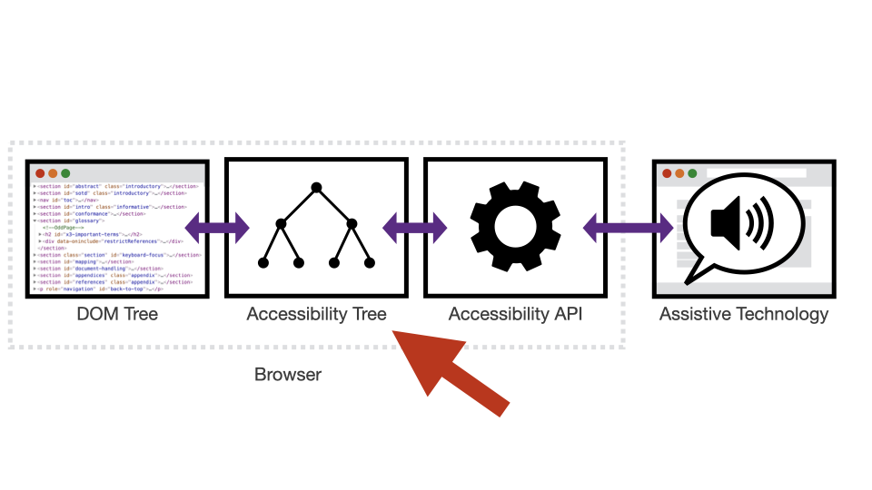
The browser uses the DOM, along with further information derived from CSS, to generate an Accessibility Tree.
This information is passed to the relevant accessibility APIs associated with the browser / operating system.
This Accessibility Tree exposes information on specific elements to Assistive Technologies via the Accessibility API.
Information includes:
- The role, name and state of each object in the content.
- How each object relates to other objects in the content.
Each browser will produce a unique Accessibility Tree due to their specific source code/Accessibility API combination.
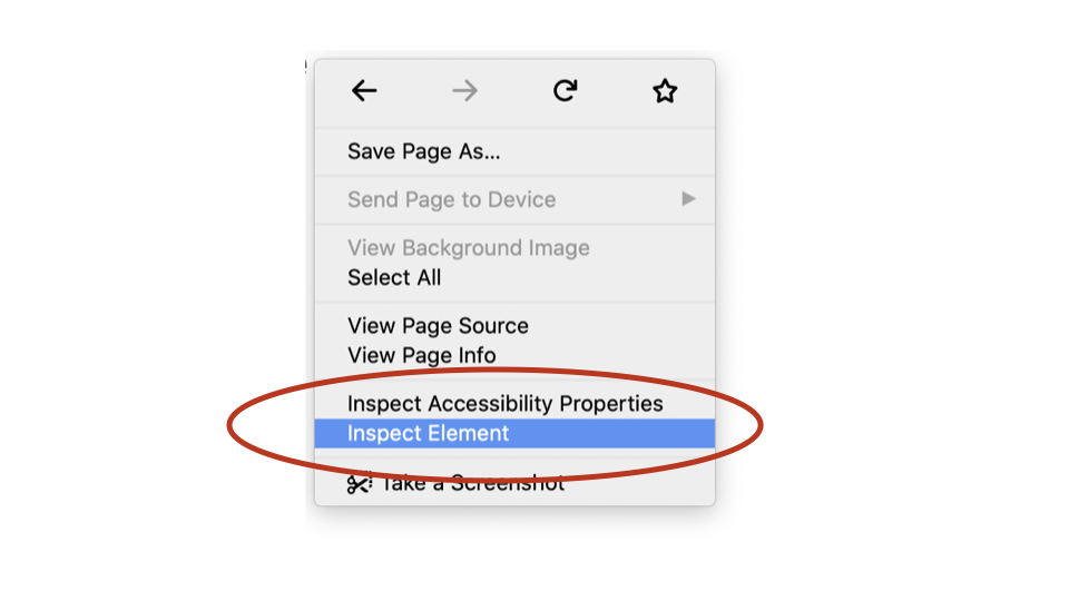
Accessing the Accessibility Tree in Firefox
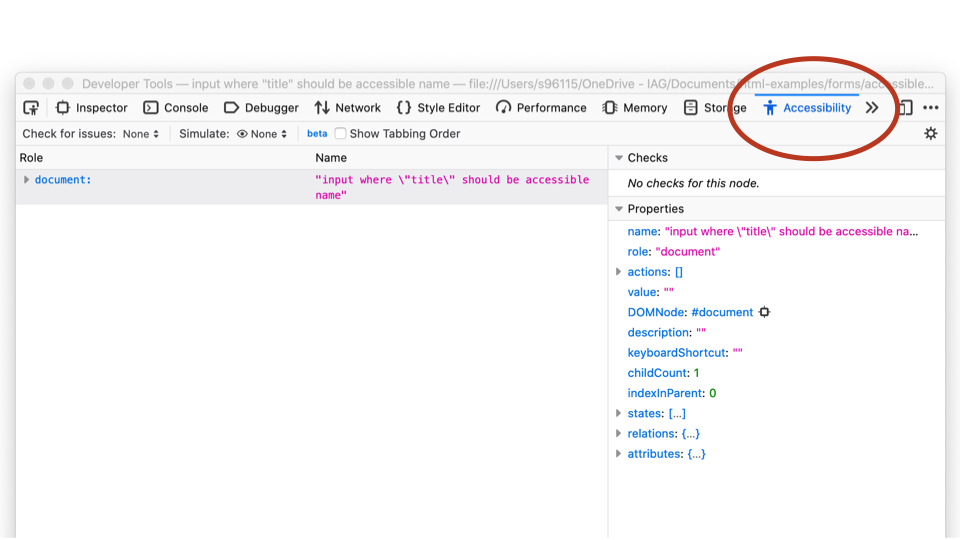
Accessing the Accessibility Tree in Chrome
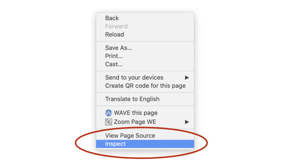
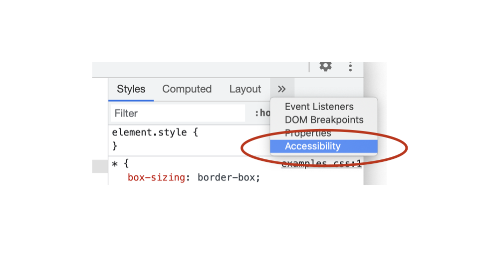
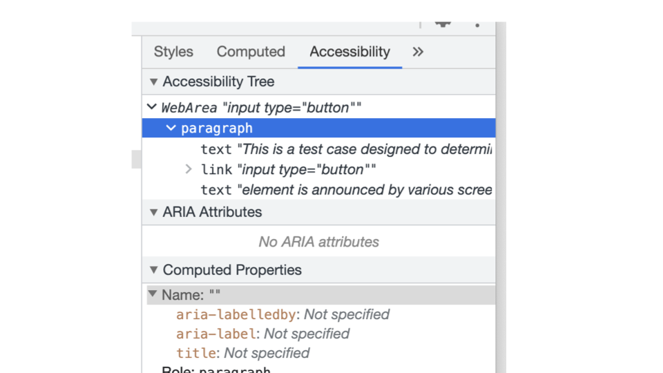
Breaking down Chrome’s Accessibility Tree
Chrome’s “Accessibility” tab has three key areas:
- Accessibility Tree.
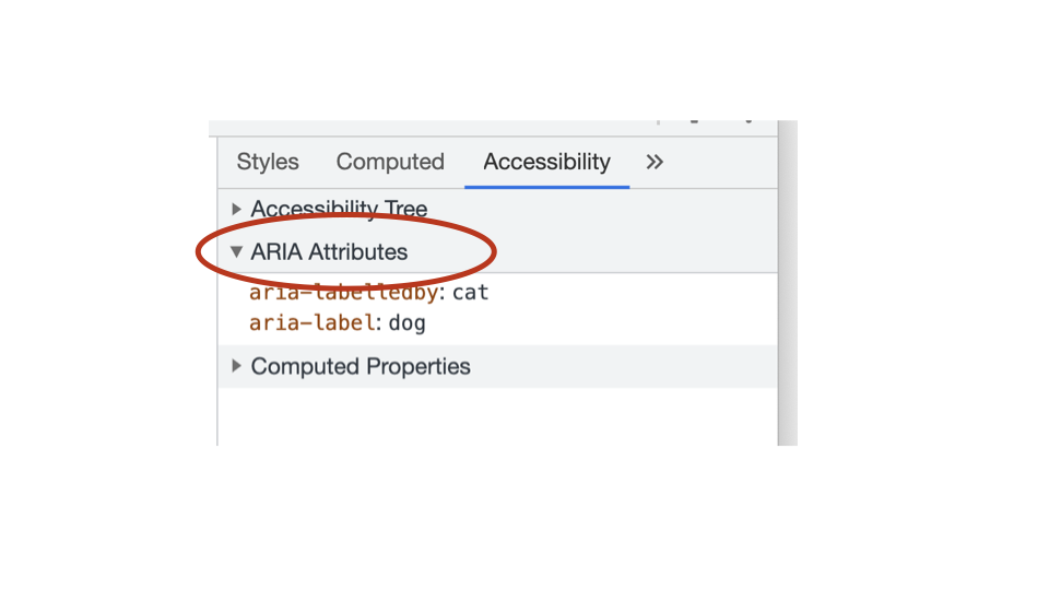
- ARIA attributes.
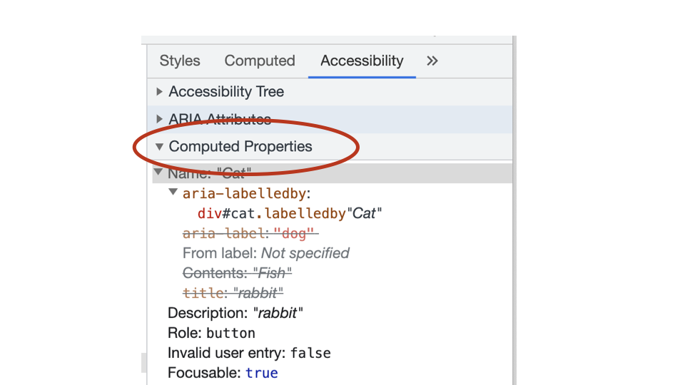
- Computed properties.
As you inspect an element in the DOM, any relevant ARIA information is presented in the Accessibility Tree tab.
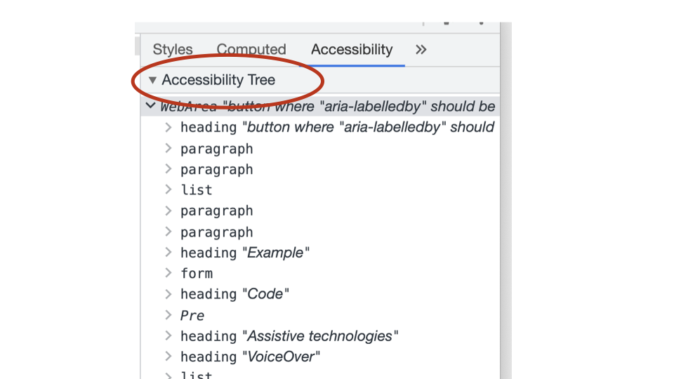
As you inspect an element in the DOM, any relevant ARIA attributes are presented in the ARIA Attributes tab.
As you inspect an element in the DOM, all the computed properties of that element are presented in the Computed Properties tab.
Any questions or comments?
4.3
Exercise: Viewing the Accessibility Tree
Browsers use the DOM tree to create a second tree, called the Accessibility Tree.
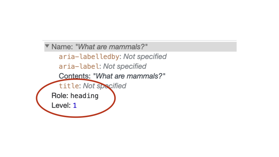
1. Heading role and level
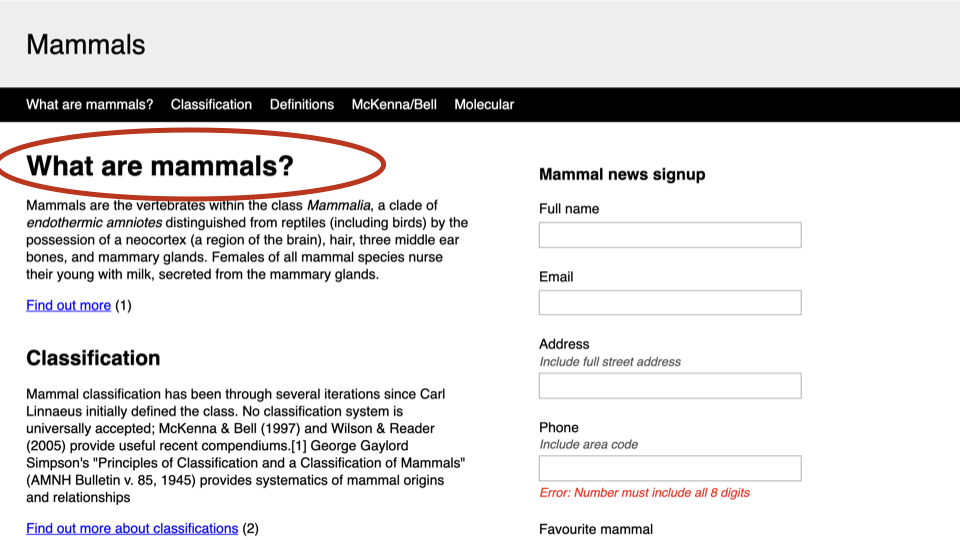
Inspect the “What are mammals?” heading. What is this elements role and level the Accessibility Tree?
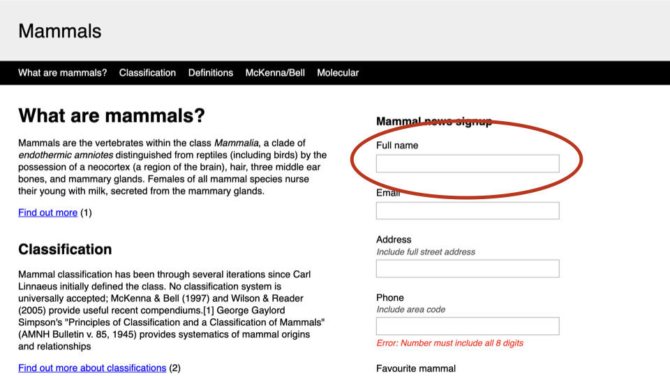
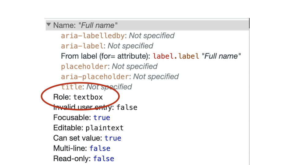
2. Input role
Inspect the “Full name” <input>. What is this elements role in the Accessibility Tree?
3. Required property
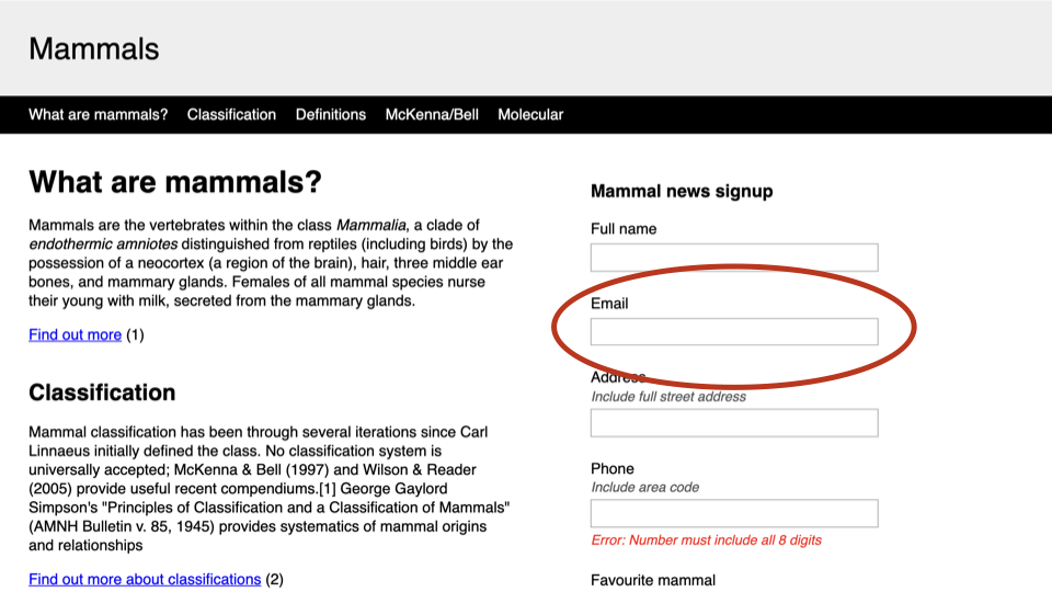
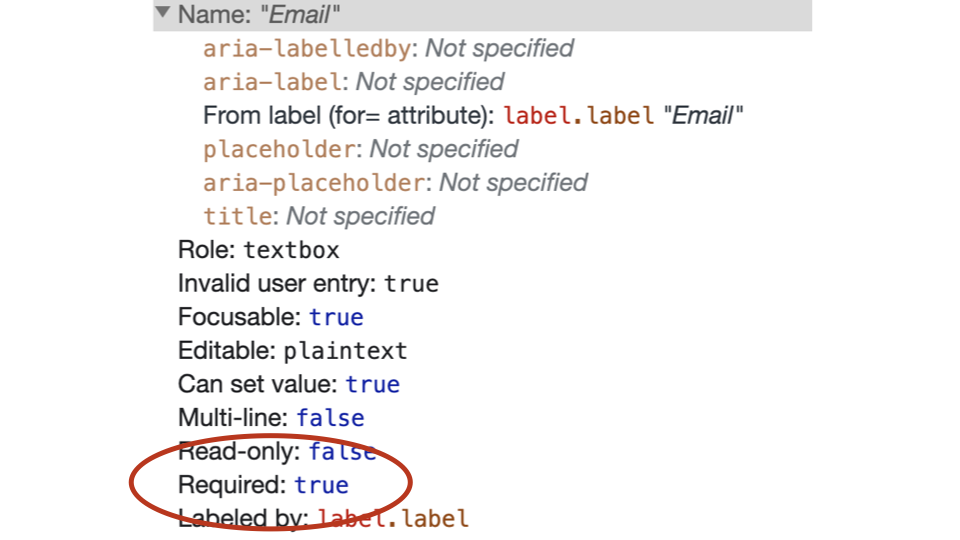
Inspect the “Email” <input>. Is this element defined as being required in the Accessibility Tree?
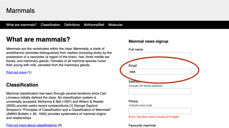
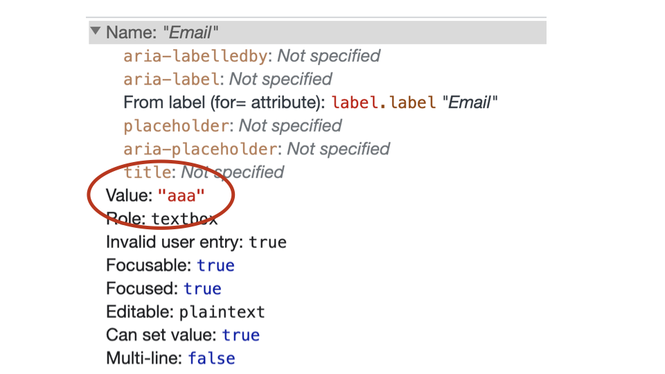
4. Input value
Type some content into the “Email” <input> field. Does the element now have a value in the Accessibility Tree?
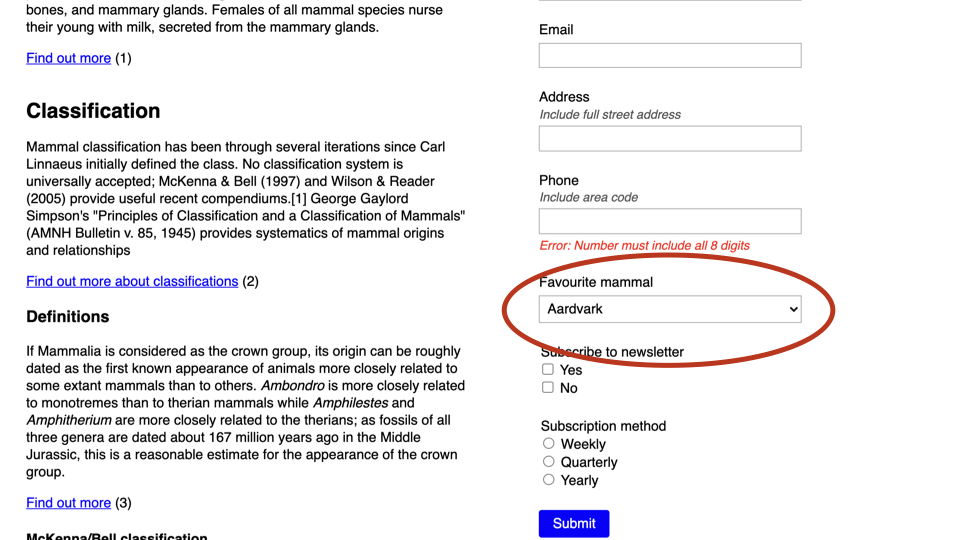
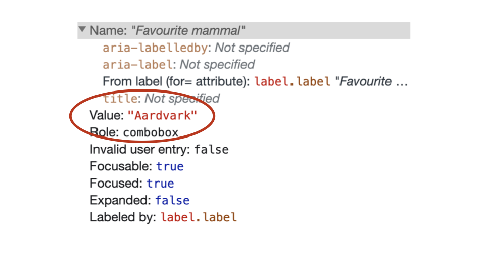
5. Select value
Choose “Aardvark” from the “Favourite Mammal” dropdown. Does the <select> element now have a value in the Accessibility Tree?
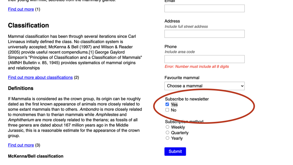
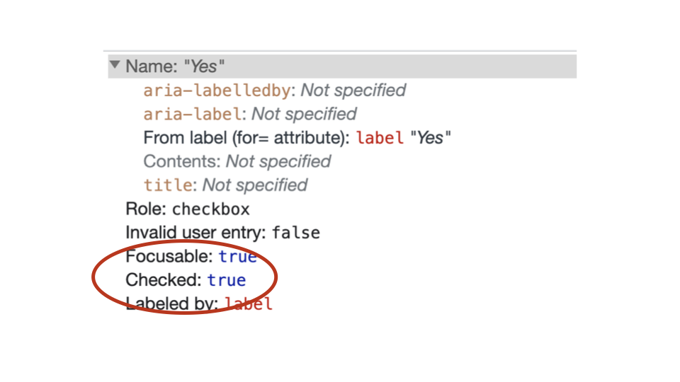
6. Checked property
Check “Yes” from the “Subscribe to newsletter” checkbox group. Does the checkbox now have a checked status in the Accessibility Tree?
A wide range of properties
As you can see, there are a wide range of possible properties that can be presented as part of the accessibility tree, depending on the element being inspected.
Some of the key accessibility tree properties include:
Name: [ accessible name as a text string ]
Role: [ pre-defined list of roles ]
Description: [ description as a text string ]
Value: [ current value as a text string ]
Required: true | false
Expanded: true | false
Checked: true | false
Disabled: true | false
Described by: [ element][#id][.class ]
Labeled by: [ element][#id][.class ]
4.4
Accessible names
Accessible names are names given to elements in the Accessibility tree.
Accessible names are very important for Assistive Technology users as they help to identify elements within the accessibility tree.
Accessible names are defined as text strings.
Chrome’s accessibility tree shows all the possible options that could be used to provide the accessible name.
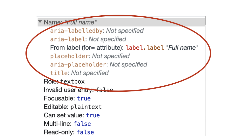
It also displays the final computed accessible name as a text string.
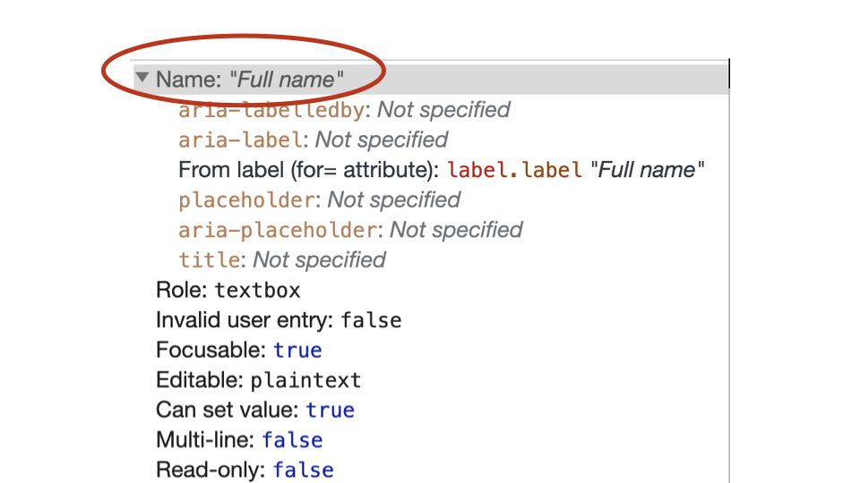
Accessible names can be applied to elements in a range of different ways, depending on the element.
Accessible name from the element itself
The contents of links and buttons can be converted into text strings and used as their accessible names.
<a href="#">Content</a>
<button>Content</button>
The value of the alt attribute for an image can be converted into a text string and used as the accessible name.
<img src="ball.jpg" alt="Content">For elements that allow the title attribute, the title value can be converted into a text string and used as the accessible name.
<button title="Content"></button>For some elements, the placeholder value can be converted into a text string and used as the accessible name.
<input type="text" placeholder="Content">For some elements, the aria-label value can be converted into a text string and used as the accessible name.
<button aria-label="Content"></button>Accessible name from other elements
The contents of the <label> element can be converted into a text string and used as the accessible name for <input>, <select> and <textarea> elements.
<label for="name">Content</label>
<input id="name" type="text">
The contents of the <caption> element can be converted into a text string and used as the accessible name for the <table> element.
<table>
  <caption>Content</caption>
</table>
The value of aria-labelledby attribute can be converted into a text string and used as the accessible name for various elements.
<div aria-labelledby="heading">
  <h2 id="heading">Content</h2>
</div>
Overall rules for accessible names
Use accessible names based on:
- Visible content for
<a>and<button>elements. <label>contents for relevant form elements.<caption>contents for<table>elements.- Alt attribute content for
<img>elements.
Whenever possible, avoid using:
placeholder.title.aria-label.aria-labelledby.
Accessible names should:
- Be concise.
- Start with a capital letter.
- Convey function or purpose, not form.
- Put the important words first.
Any questions or comments?
4.5
Exercise: Viewing Accessible names
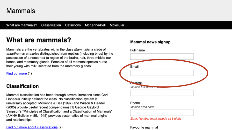
1. Finding the name
Inspect the “Email” <input>. What is this elements name in the Accessibility Tree?
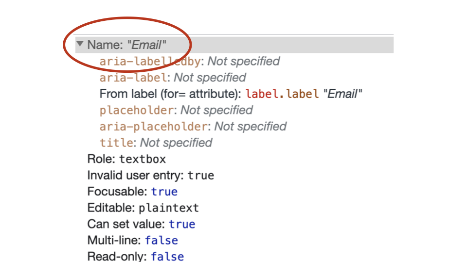
In this case, the accessible name is taken from the for attribute of the <label> element.
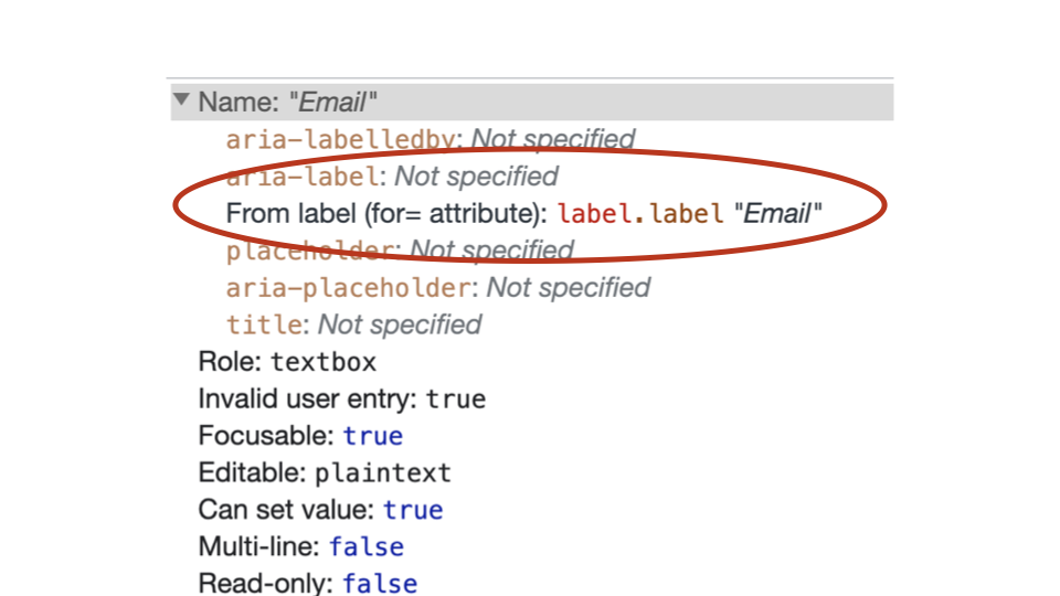
2. What happens when there is no name?
In the DOM, remove for="form-email" from the “Email” <label> element. Does the element have a name in the Accessibility Tree now?
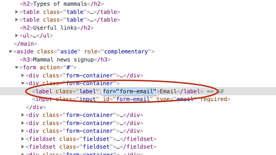
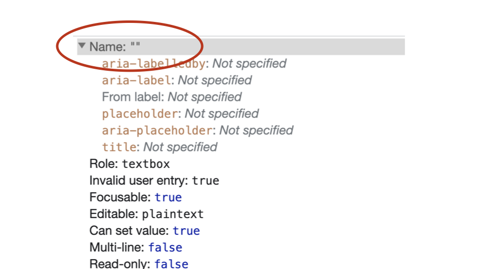
This form field now has no accessible name, so there is no way for Assistive Technologies to understand its purpose.
3. Does the fieldset have an accessible name?
Inspect the <fieldset> element associated with “Subscribe to newsletter”. Does it have a name in the Accessibility Tree?
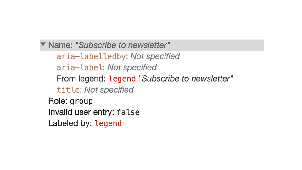
4. Does the main have an accessible name?
Inspect the <main> element above the “What are mammals” heading. Does it have a name in the Accessibility Tree?
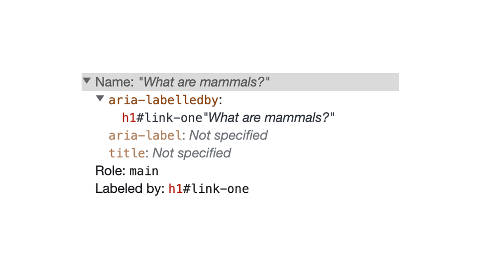
5. What if there is more than one possible accessible name?
Look at the first “Find out more” link on the page. In theory, the accessible name for this element should be “Find out more” from the contents of the link.
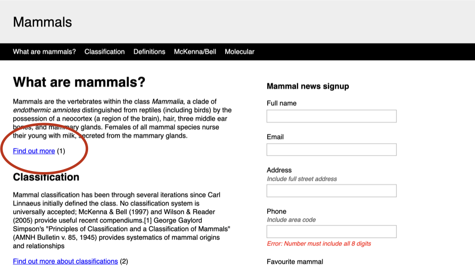
However, the element has also been given an aria-label, which provides a different accessible name of “Find out more about mammals”.
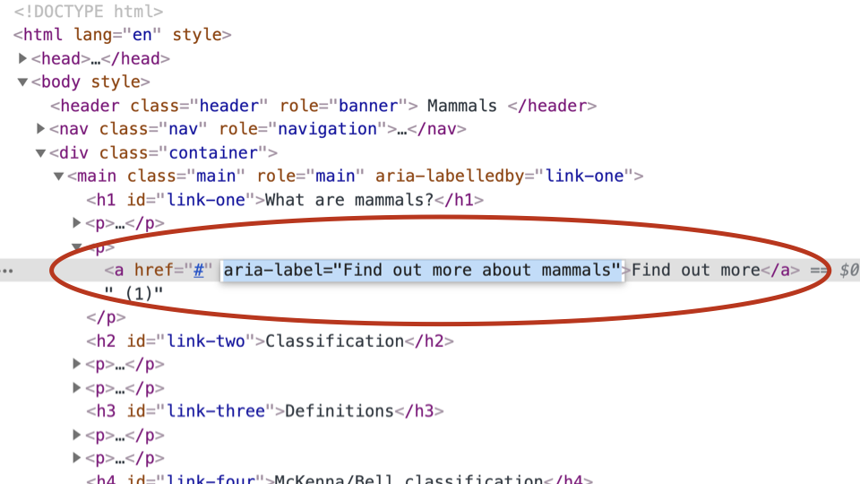
So, there are two possible accessible names. Which one wins? The answer is displayed in the accessibility tree.
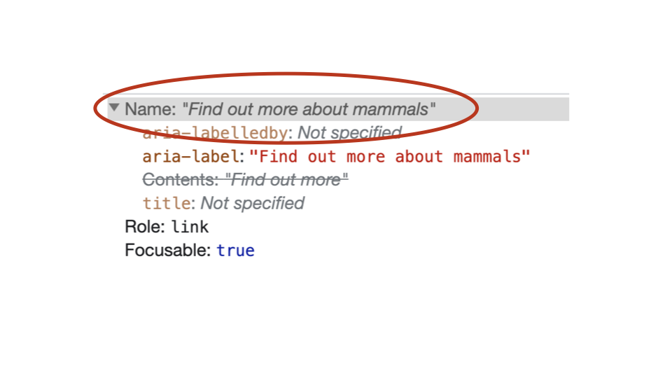
Notice how the accessibility tree interface displays the link contents as crossed out, while the aria-label content is highlighted.
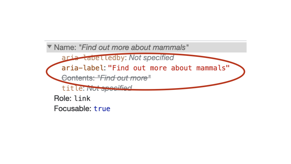
This means the aria-label content will be used as the accessible name for this element.
4.6
Accessible descriptions
An accessible description provides additional information, related to an interface element, that complements the accessible name.
The accessible description might or might not be presented visually on-screen.
Accessible descriptions are defined as text strings.
Any questions or comments?
4.7
Exercise: Viewing accessible descriptions
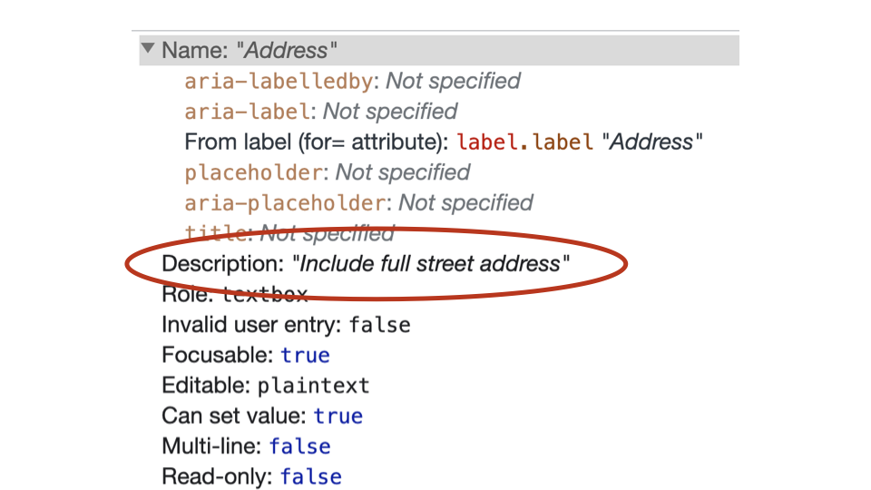
Inspect the “Address” input. What is this elements description in the Accessibility Tree?

4.8
How names and descriptions are announced
How are the accessible name and description announced in different screen readers?
Screen readers announce objects within the accessibility tree in the following order:
- Accessible name.
- Role.
- Description.
- Additional instructions.
let’s use the “Address” <input> again to see the announcement order in different screen readers.
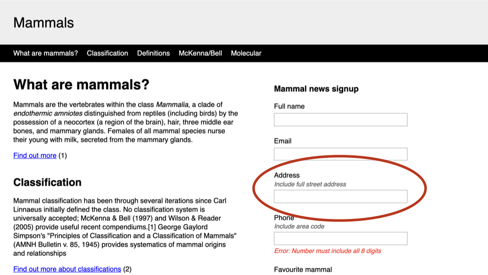
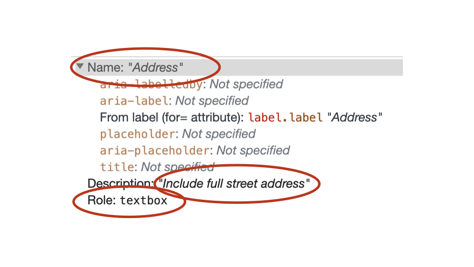
With Voiceover, there is a pause after the accessible name and role are announced.
OSX / VoiceOver / Chrome
- Accessible name: “Address”.
- Role: “Edit text”.
- [Pause].
- Description: “Include full street address”.
- Additional instructions: “You are currently on a text field. To enter text in this field, type.”.
Windows / NVDA / Chrome
- Accessible name: “Address”.
- Role: “Edit”.
- Description: “Include full street address”.
- Additional instructions: “Blank”.
Windows / JAWS / Chrome
- Accessible name: “Address”.
- Role: “Edit”.
- Description: “Include full street address”.
- Additional instructions: “Type in text”.
Any questions or comments?
4.9
What is WAI-ARIA?
Web Accessibility Initiative (WAI)
WAI is a working group that develops standards and support materials to help implement accessibility.
Accessible Rich Internet Applications (ARIA)
ARIA is a standard that defines a way to make websites and web apps more accessible to people with disabilities.
ARIA especially helps with dynamic content and advanced user interface controls developed with HTML and JavaScript.
WAI-ARIA 1.0 was published as a completed W3C Recommendation on 20 March 2014.
WAI-ARIA 1.1 was published as a completed W3C Recommendation on 14 December 2017.
WAI-ARIA 1.2 was published as a completed W3C Working Draft 18 December 2019. This means it is still not the official standard yet!
4.10
How does ARIA work?
How ARIA works can be defined in three simple statements:
- WAI ARIA is a series of custom HTML attributes.
- These attributes can be used to change and augment the Accessibility Tree.
- They provide addition information to Assistive Technologies.
ARIA can be used change and augment the Accessibility Tree in the following ways:
1. Add semantics to the accessibility tree
i.e. adding semantics to generic elements via the role attribute.
<div role="button"></div>2. Modify existing semantics to the accessibility tree
i.e. modifying the existing semantics of elements via the role attribute.
<button role="tab"></button>3. Apply states to the accessibility tree
i.e. informing Assistive Technologies of a widget’s current state.
<button aria-expanded="true"></button>4. Provide or improve accessible names in the accessibility tree
i.e. adding additional labelling to elements.
<button aria-label="Close modal"></button>5. Provide descriptions to the accessibility tree
i.e. adding descriptions to elements.
<input type="text" aria-describedby="a1">
<span id="a1">Error message</span>
6. Establish relationships in the accessibility tree
i.e. informing Assistive Technologies of the relationships between specific elements, than may not be possible via the DOM.
<button role="tab" aria-controls="a1"></button>
<div role="tabpanel" id="a1"></div>
7. Informing Assistive Technologies about possible changes to the DOM
i.e. Defining region “live” and may change.
<div aria-live="polite"></div>ARIA does not do...
ARIA does not do any of the following:
- Modify an element’s visual appearance.
- Modify the element’s behaviour.
- Add focusability.
- Add keyboard functionality.
ARIA attributes are broken down into three categories:
- Roles.
- States.
- Properties.
4.11
Roles, states and properties
Roles
ARIA roles are HTML attributes that are added to elements using:
role="[role-type]".
ARIA roles can be used to add or change the semantic meaning of HTML elements in the accessibility tree.
For example: Is the element a menu, slider, spinner, progress bar?
<div role="tabpanel"></div>A list of all roles, including how they have changed in different versions of ARIA.
States and properties
ARIA state and properties are HTML attributes that are added to elements using:
aria-[state|property]=[property-type]
ARIA states define the current state of HTML elements in the accessibility tree.
For example: Is the element checked or disabled?
<input aria-disabled="true" type="text">ARIA properties define purpose or relationships of HTML elements in the accessibility tree.
For example: "Does the element have a description? Does the element interact with other elements?
<input aria-describedby="format">
<span id="format">(mm/dd/yyyy)</span>
A list of all states and properties, including how they have changed in different versions of ARIA.
Any questions or comments?
4.12
Exercise: Creating a fake checkbox
Files:
- Open exercises/exercise07-start.html in a text editor and browser.
- View exercises/exercise07-finished.html to check your results.
Our aims are to:
- Add
role="checkbox"to each of the fake checkboxes. - Add
aria-checked="false"to each of the fake checkboxes. - Add
role="group"to the parent container. - Add
aria-labelledby="group-label"to the parent container . - Add
id="group-label"to the<h3>element.
Imagine you have to make a checkbox group, but you have to to use <div> elements instead of native checkboxes.
As you will see:
- Some basic JavaScript is already in place.
- Keyboard focus is in place via
tabindex="0".
However, this widget is completely inaccessible to assistive technologies.
- The elements have no role defined.
- The elements have no checked state defined.
- The
<h3>heading is not programmatically associated with the checkbox group.
Step 1:
Add role="checkbox" to each of the fake checkboxes.
<div
  class="checkbox"
  tabindex="0"
  role="checkbox"
>
  Lettuce
</div>
<div
class="checkbox"
tabindex="0"
role="checkbox"
>
Tomato
</div><div
class="checkbox"
tabindex="0"
role="checkbox"
>
Mustard
</div>Step 2:
- Add
aria-checked="true"to the first fake checkbox. - Add
aria-checked="false"to other fake checkboxes.
<div
  class="checkbox"
  tabindex="0"
  role="checkbox"
  aria-checked="true"
>
  Lettuce
</div>
<div
class="checkbox"
tabindex="0"
role="checkbox"
aria-checked="false"
>
Tomato
</div><div
class="checkbox"
tabindex="0"
role="checkbox"
aria-checked="false"
>
Mustard
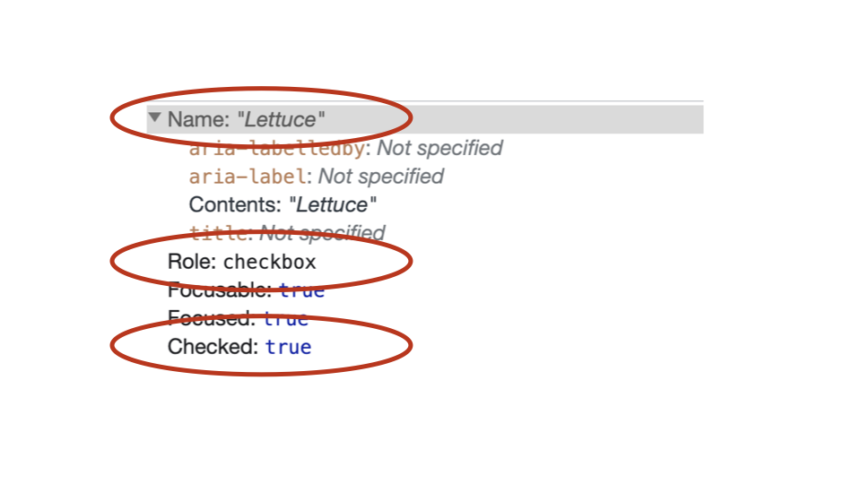
</div>If we inspect any of the fake checkboxes in the accessibility tree, they now have roles and states.
Step 3:
Add role="group" to the parent container so that we can create a fake <fieldset>.
<div
  role="group"
>
</div>
Step 4:
Add aria-labelledby="group-label" to the parent container so we can give it an accessible name.
<div
  role="group"
  aria-labelledby="group-label"
>
</div>
Step 5:
Add id="group-label" to the <h3> element. Now it will operate like a fake <legend>.
<h3 id="group-label">Choose some toppings</h3>If we inspect the parent container in the accessibility tree, it now has an accessible name and a role.
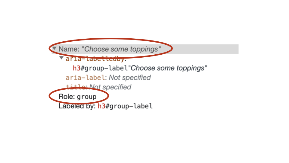
This is a quick example to show how ARIA is used to augment the accessibility tree to help Assistive Technologies.
4.13
aria-labelledby
This is where a primary element is given a label (another name for an accessible name) by a secondary element.
The aria-labelledby attribute is applied to the primary element, and the matching ID value is applied to the secondary element.
So, the primary element is literally being “labelled by” the secondary element in the accessibility tree.
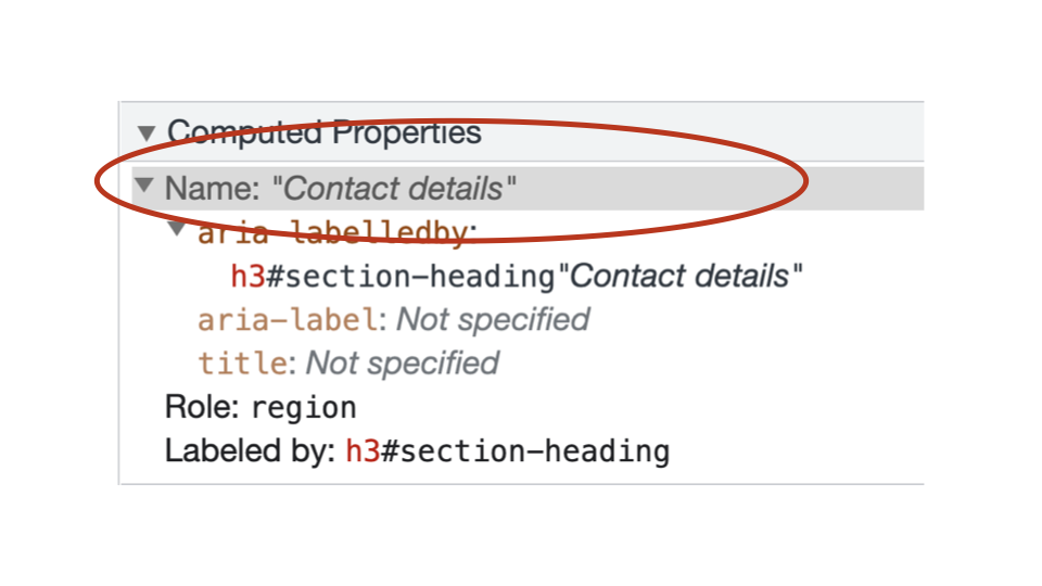
<section aria-labelledby="section-heading">
  <h3 id="section-heading">Contact details</h3>
</section>
This <section> element will now have an accessible name of “Contact details” in the accessibility tree because it is being “labelled by” the <h3> element.
Any questions or comments?
4.14
Exercise: Using aria-labelledby
Files:
- Open exercises/exercise08-start.html in a text editor and browser.
- View exercises/exercise08-finished.html to check your results.
Our aims are to:
- Add
aria-labelledby="section-heading"the the<div>. - Add
id="section-heading"to the<h3>. - View the accessible name in the Accessibility Tree.
<!-- Before -->
<section>
  <h3>Contact details</h3>
</section>
<!-- Step 1: add aria-labelledby -->
<section aria-labelledby="section-heading">
<h3>Contact details</h3>
</section><!-- Step 2: add id -->
<section aria-labelledby="section-heading">
<h3 id="section-heading">Contact details</h3>
</section>4.15
aria-label
The aria-label attribute is used to provide a label directly to the element itself.
The primary element is literally being “given a label” in the accessibility tree.
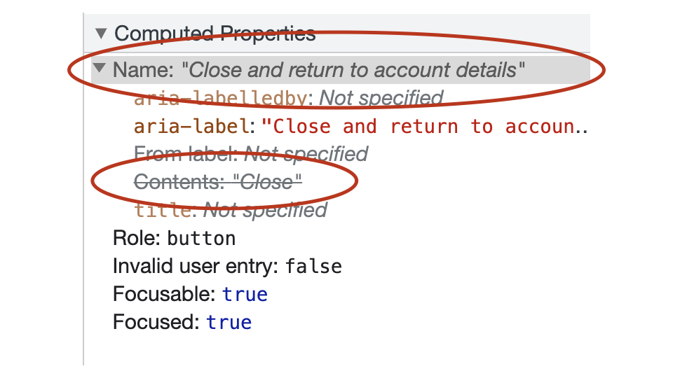
<button
  type="button"
  aria-label="Close and return to account details"
>
Close
</button>
This <button> element will now have an accessible name of “Close and return to account details” in the accessibility tree.
In fact, if you look in the accessibility tree, the contents of the <button> is replaced by the aria-label as the accessible name.
Any questions or comments?
4.16
Exercise: Using aria-label
Files:
- Open exercises/exercise09-start.html in a text editor and browser.
- View exercises/exercise09-finished.html to check your results.
Our aims are to:
- Add
aria-label="Close and return to account details"the the<button>. - View the accessible name in the accessibility tree.
<!-- Before -->
<button
  class="button"
  type="button"
>
  Close
</button>
<!-- Step 1: Add aria-label -->
<button
class="button"
type="button"
aria-label="Close and return to account details"
>
Close
</button>
4.17
aria-describedby
This is where a primary element is given a description by a secondary element.
The aria-describedby attribute is applied to the primary element, and the matching ID value is applied to the secondary element.
So, the primary element is literally being “described by” the secondary element in the accessibility tree.
<label for="a">Phone</label>
<input id="a" type="text" aria-describedby="i1">
<p id="i1">Error: Include area code</p>
This <input> element already has an accessible name of “Phone”.
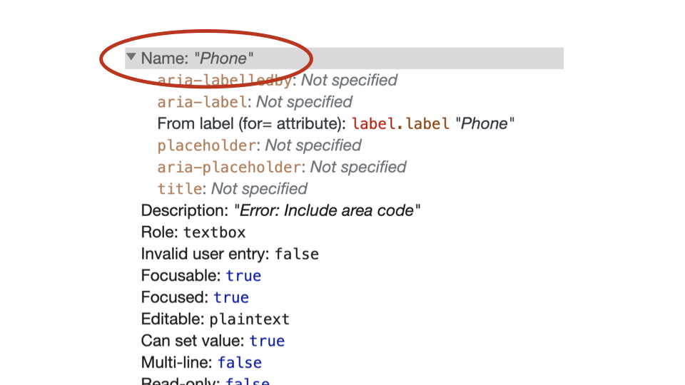
However, it will now has an accessible description of “Error: Include area code” in the accessibility tree.
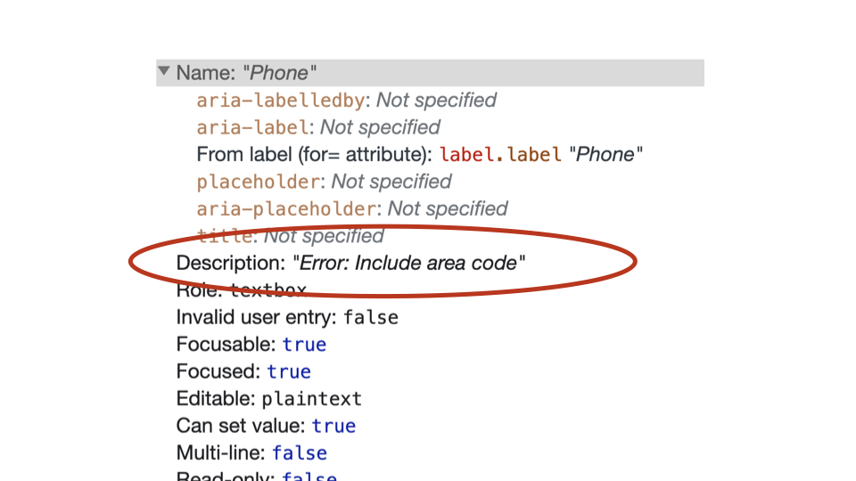
The aria-describedby attribute cannot provide an accessible name in the accessibility tree - it is just for descriptions.
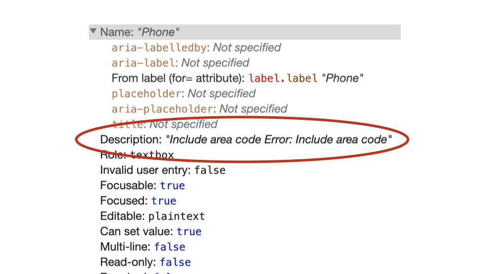
Multiple descriptions can be applied to a single element using aria-describedby. They are defined using space-separated values.
<label for="a">Phone</label>
<p id="hint1">Include an area code</p>

<input id="a" type="text" aria-describedby="hint1 error1">
<p id="error1">Error: Include area code</p>
The order that these elements are defined within the aria-describedby value determines the order in which the descriptions are announced.
In this case, because hint1 is defined before error1 the accessible description will be:
“Include an area code Error: Include area code”
Any questions or comments?
4.18
Exercise: Using aria-describedby
Files:
- Open exercises/exercise10-start.html in a text editor and browser.
- View exercises/exercise10-finished.html to check your results.
Our aims are to:
- Add
id="hint"to the<span>element with a class ofhelp-text. - Add
id="error"to the<span>element with a class oferror-message. - Add
aria-describedby="hint error"to the<input>element. - View the accessible name in the accessibility tree.
<!-- Before -->
<label class="label" for="b">Phone</label>
<span class="help-text">
  Include area code
</span>
<input
  class="input"
  id="b"
  type="text"
>
<span class="error-message">
  Error: Include area code
</span>
<!-- Step 1: add id to help-text span -->
<label class="label" for="b">Phone</label>
<span class="help-text" id="hint">
Include area code
</span>
<input
class="input"
id="b"
type="text"
>
<span class="error-message">
Error: Include area code
</span><!-- Step 2: add id to error-message span -->
<label class="label" for="b">Phone</label>
<span class="help-text" id="hint">
Include area code
</span>
<input
class="input"
id="b"
type="text"
>
<span class="error-message" id="error">
Error: Include area code
</span><!-- Step 3: add aria-describedby -->
<label class="label" for="b">Phone</label>
<span class="help-text" id="hint">
Include area code
</span>
<input
class="input"
id="b"
type="text"
aria-describedby="hint error"
>
<span class="error-message" id="error">
Error: Include area code
</span>